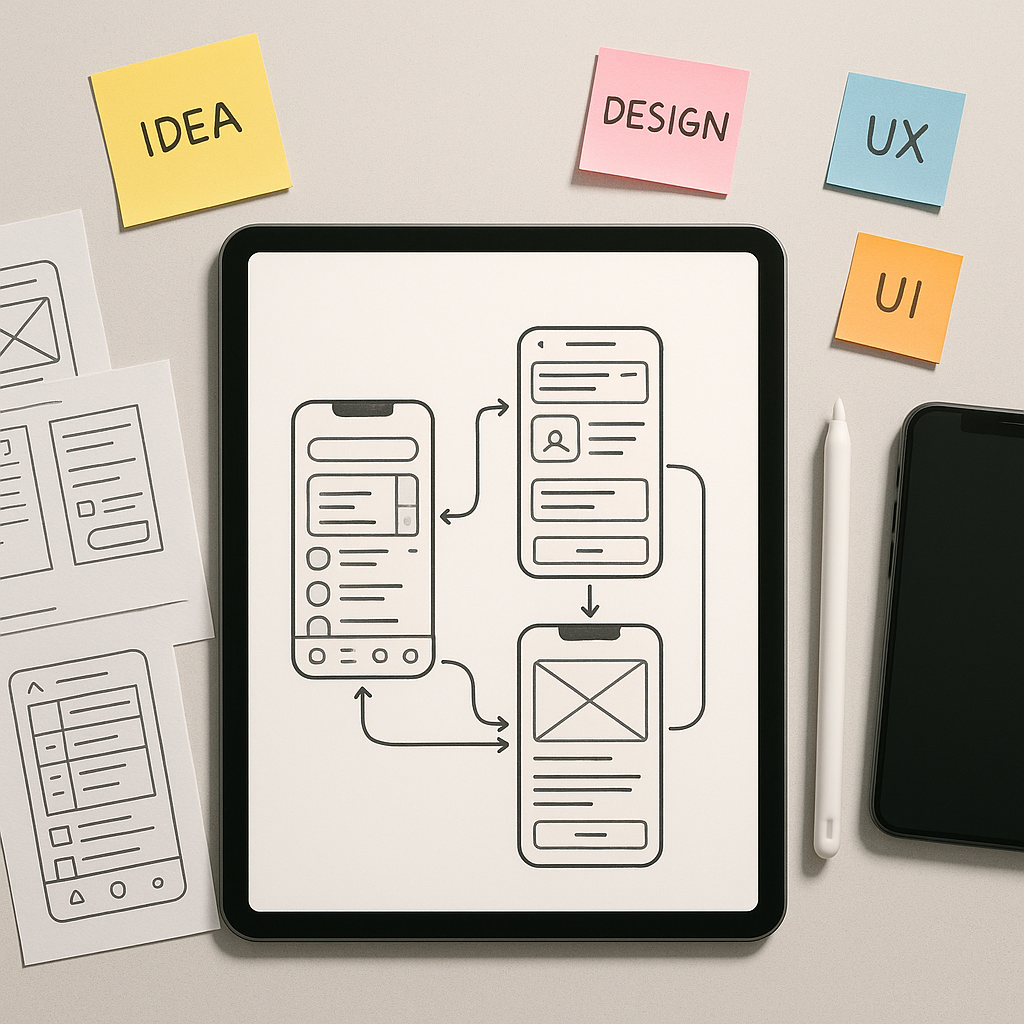
The Why and What of Mobile App Prototyping
Every groundbreaking mobile app begins not with code, but with an idea. However, an idea is abstract and fragile. To give it form, to test its assumptions, and to communicate its vision effectively, you need a prototype. A prototype is far more than a simple sketch; it’s an interactive, functional model of your app that simulates the end-user experience. It allows stakeholders, potential users, and your development team to see, touch, and navigate your concept long before significant engineering resources are committed. This process is not a mere formality; it is a critical strategic step that de-risks your project. By building a tangible representation of your app, you can validate your core concept, test usability with real people, and uncover design flaws when they are still easy and inexpensive to fix. The cost of correcting an error during the design phase is a fraction of what it would be post-launch. A report from the Systems Sciences Institute at IBM highlighted that fixing a bug after release can be four to five times more expensive than addressing it during design, a cost that can skyrocket during long-term maintenance. A prototype acts as your primary tool for early-stage quality assurance, ensuring the product you eventually build is one that users will actually want and understand.
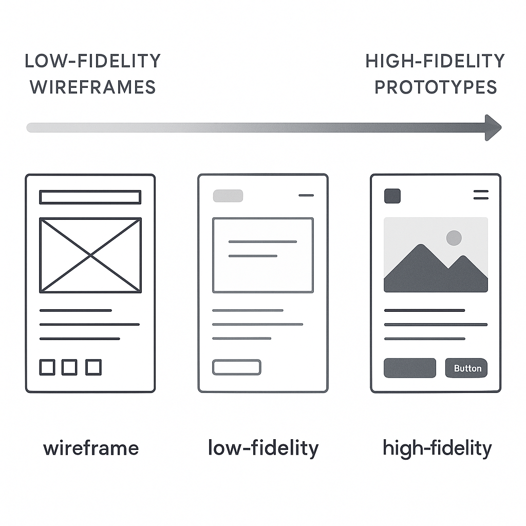
The world of prototyping is not monolithic; it exists on a spectrum of fidelity, which refers to how closely the prototype resembles the final product in terms of visual detail and interactivity. At one end, you have low-fidelity (lo-fi) prototypes. These are often digital wireframes linked together, focusing purely on structure, user flow, and layout without the distraction of colors, fonts, or branding. They are quick to create and perfect for testing the fundamental logic of your app’s navigation. In the middle sits mid-fidelity (mid-fi), which adds a bit more detail, perhaps some grayscale UI elements and more defined content placeholders. At the other end is the high-fidelity (hi-fi) prototype. This version looks and feels almost indistinguishable from the final app. It incorporates detailed UI design, branding, realistic content, complex animations, and micro-interactions. The choice of fidelity depends on your goal. Early-stage idea validation calls for the speed and flexibility of lo-fi, while late-stage user testing or investor pitches demand the realism and polish of a hi-fi prototype. Understanding this spectrum is the first step toward choosing the right approach for your specific needs at each stage of the product development lifecycle.
Laying the Foundation: Pre-Prototyping Essentials
Define Your Core Idea and User Persona
Before you can build a model of your app, you must have a crystal-clear understanding of what it is and who it is for. This foundational step is often rushed but is arguably the most important. Start by articulating a concise problem statement. What specific pain point are you solving for your users? A vague goal like “making a social media app” is a recipe for a bloated, unfocused product. A better problem statement might be, “Professionals in creative fields need a way to quickly create and share a portfolio of their work from their mobile device to respond to time-sensitive job opportunities.” This clarity guides every subsequent decision. Once the problem is defined, you must deeply understand the people who experience it. This is where user personas come into play. A user persona is a detailed, semi-fictional character profile that represents your ideal user. It goes beyond simple demographics like age and location to include their goals, motivations, frustrations, and technical proficiency. For our portfolio app, a persona might be “Chloe, a 28-year-old freelance graphic designer who is often on the go and needs to showcase her latest work to potential clients with minimal friction.” When you design for Chloe, you are no longer designing for an abstract “user” but for a person with specific needs and behaviors, leading to more empathetic and effective design choices.
Map Out User Flows and Key Features
With a clear problem and a target user in mind, the next step is to map out the journey they will take within your app. A user flow is a visual representation of the path a user follows to accomplish a specific task, from their entry point to the final action. For Chloe, a critical user flow would be “Adding a new project to her portfolio.” This flow would include steps like tapping ‘Add New’, selecting images or videos from her phone, adding a title and description, and publishing the project. Mapping these flows, often as simple diagrams with boxes and arrows, forces you to think through the logical sequence of screens and actions. It helps identify potential dead ends, confusing steps, or missing functionality before you’ve invested time in detailed design. This process naturally leads to a list of required features. To avoid feature creep, it’s crucial to prioritize. A common method is to categorize features into must-haves, should-haves, could-haves, and won’t-haves. This helps define your Minimum Viable Product (MVP)—the version of your app with just enough features to be usable by early customers who can then provide feedback for future product development. Creating a simple feature prioritization matrix can bring immense clarity to your project’s scope and ensure you are building the most impactful elements first, saving more complex or “nice-to-have” features for later iterations.
| Feature | Priority (High/Med/Low) | Justification |
|---|---|---|
| User Account Creation | High | Core requirement for personalized portfolio management. |
| Upload Project (Image/Video) | High | The primary function of the app. |
| Edit Project Details | High | Allows users to manage and update their content. |
| Social Media Sharing | Medium | Expands reach but is not critical for initial portfolio creation. |
| In-App Messaging | Low | A complex feature that can be added in a later version. |
Sketching and Wireframing: The Blueprint
The transition from abstract flows to tangible screens begins with sketching. Sketching is the fastest way to explore different layout ideas. Using nothing more than a pen and paper, you can generate dozens of variations for a single screen in minutes. The goal here is not to create a work of art but to externalize your thoughts and experiment with the placement of key elements like buttons, images, and text. This low-cost, high-speed exploration phase is invaluable for creative problem-solving. Once you have a few promising sketches, you move on to wireframing. A wireframe is a digital, structural blueprint of your app. It’s a clean, grayscale representation that focuses exclusively on layout, information hierarchy, and functionality. By deliberately omitting colors, fonts, and images, wireframes force you and your stakeholders to focus on the core user experience and structure. Is the primary call-to-action clear? Is the navigation intuitive? Is the information organized logically? These are the questions wireframes help answer. They serve as the skeletal framework upon which you will build your interactive prototype. Many developers and designers find that solidifying these fundamentals early on prevents major structural changes down the line, and you can learn more by exploring some fundamental Mobile UX Design Tips & Tricks to inform your layouts.
The Prototyping Process: From Static to Interactive
Choosing Your Prototyping Tool
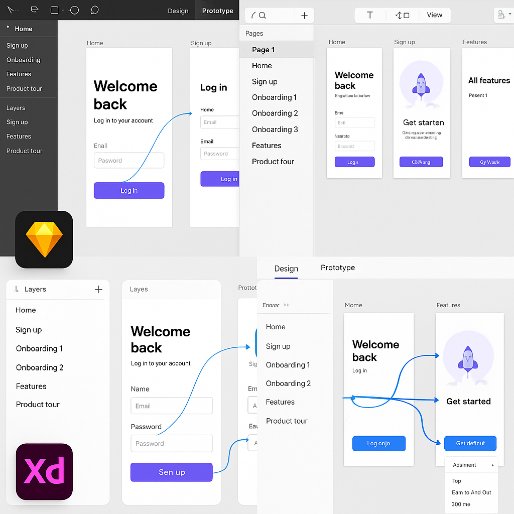
With your wireframes ready, it’s time to select the tool that will bring them to life. The market is filled with excellent options, each with its own strengths, so the right choice depends on your project’s needs, your team’s skills, and your desired level of fidelity. The most popular category includes design-focused tools like Figma, Sketch, and Adobe XD. These applications excel at creating visually stunning user interfaces and then adding interactive links between screens to simulate user flows. They are relatively easy to learn and are built for collaboration. According to a 2023 survey by UXTools.co, Figma has cemented its position as the dominant force, with nearly 80% of designers using it as their primary UI design tool. Its real-time collaboration and browser-based accessibility make it a favorite for teams of all sizes. For those seeking even higher fidelity, there are code-based or advanced prototyping tools like Framer and Origami Studio. These platforms allow you to create more sophisticated animations, intricate micro-interactions, and data-driven prototypes that feel incredibly realistic. They often have a steeper learning curve as they may require some knowledge of code or logic-based systems, but they provide unparalleled power for fine-tuning the user experience. If you’re interested in exploring this more powerful tier of tools, a great place to start is an Origami Studio Tutorial for Mobile Prototyping: Getting Started, which can introduce you to the node-based logic that drives its advanced interactions. Your choice of tool will define your workflow, so consider factors like collaboration features, platform compatibility (macOS vs. Windows), pricing, and the specific interactive capabilities you’ll need.
| Tool | Best For | Learning Curve | Pricing Model |
|---|---|---|---|
| Figma | Collaborative UI design, all-around prototyping | Low | Freemium |
| Adobe XD | Integration with Adobe Creative Cloud | Low-Medium | Subscription |
| Sketch | macOS native UI design, robust plugin ecosystem | Low-Medium | Subscription |
| Framer | High-fidelity, code-based prototypes, web integration | Medium-High | Freemium |
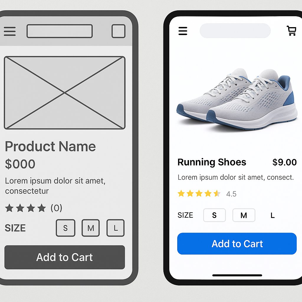
Building Your Low-Fidelity (Lo-Fi) Prototype
Your first interactive prototype will likely be a low-fidelity one. The process involves importing your static wireframes into your chosen tool and then creating “hotspots” or links that connect the different screens. For example, you would draw a hotspot over a “Login” button on the home screen and link it to the “Login” screen artboard. By repeating this process for all the interactive elements in your user flow—buttons, navigation tabs, list items—you create a clickable, navigable path through your app. This lo-fi prototype doesn’t have the final visual design, but it has the functional soul of the application. The primary purpose of this stage is to test the core information architecture and user flow. Can a user successfully navigate from point A to point B without confusion? Does the flow make logical sense? Are there any glaring gaps or dead ends? Because you haven’t invested time in detailed visual design, feedback at this stage is focused entirely on functionality and structure. It’s also incredibly easy to make changes. If testing reveals a confusing step, you can simply reroute a link or adjust a wireframe layout in minutes, rather than overhauling a fully designed screen. This agility is the key strength of lo-fi prototyping, allowing for rapid iteration and validation of the app’s fundamental blueprint. For a deeper dive into this concept, the Nielsen Norman Group offers an excellent breakdown of Low-Fidelity vs. High-Fidelity Prototyping.
Crafting the High-Fidelity (Hi-Fi) Prototype
Once your user flows are validated with a lo-fi prototype, it’s time to elevate it to high fidelity. This is where you transform the structural blueprint into something that looks and feels like a real, polished application. This stage involves applying the final UI design, which includes the color palette, typography, iconography, and branding elements. You’ll replace the grayscale boxes and placeholder text of your wireframes with detailed components, realistic imagery, and actual copy. A rich source for pre-made and customizable design assets can be found on marketplaces like UI8 – Curated Design Resources, which can significantly speed up the UI design process. But a hi-fi prototype is more than just a collection of beautiful static screens. Its defining characteristic is its advanced interactivity. This means adding subtle micro-interactions, such as a button changing color on press or a satisfying animation when an item is added to a cart. It also involves creating smooth screen transitions, like sliding panels or modal pop-ups, that mimic the behavior of a native application. Modern prototyping tools make it possible to implement these details without writing code, using features for smart animation, component states, and conditional logic. The goal is to create an experience so immersive that users might forget they aren’t using a finished product. This level of realism is essential for final usability testing, stakeholder presentations, and for providing developers with an unambiguous reference for how the app should behave.
Testing and Iterating: The Feedback Loop
Conducting Usability Testing
A prototype, no matter how beautiful or well-crafted, is built on a series of assumptions. The only way to validate these assumptions is to put it in front of real users. Usability testing is the practice of observing people as they attempt to complete tasks using your prototype. The goal is to identify areas of friction, confusion, and frustration in the user experience. Your test participants should ideally be representative of your target audience—the people you defined in your user personas. You can recruit them from your existing network, social media groups, or dedicated user testing platforms. The testing sessions themselves can be moderated, where a facilitator guides the user and asks follow-up questions, or unmoderated, where the user completes tasks on their own while their screen and voice are recorded. A key technique in either format is to encourage participants to use the “think aloud” protocol, where they verbalize their thoughts, expectations, and reactions as they navigate the prototype. This provides invaluable qualitative insight into their mental model. You are not looking for compliments on your design; you are hunting for problems. Pay close attention to where they hesitate, what they click on that isn’t interactive, and whether they can successfully complete the key tasks you designed the flows for. Comprehensive resources like Maze’s Guide to Usability Testing can provide structured methodologies for planning and executing effective tests.
Gathering Feedback and Refining Your Design
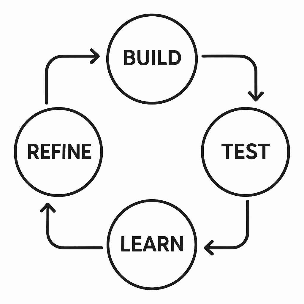
After completing a round of usability tests, you will be left with a wealth of data—recordings, notes, and observations. The next crucial step is to synthesize this feedback to find actionable insights. It’s important to look for patterns and recurring themes rather than getting sidetracked by one-off comments. If three out of five testers struggled to find the settings menu, that’s a clear signal that its placement or labeling is a problem. If only one person mentioned they disliked a specific color, it might be a matter of personal taste rather than a critical usability issue. Organize the identified problems and user quotes into categories, such as “Navigation Issues,” “Content Clarity,” or “Interaction Confusion.” Once you have a clear list of problems, you need to prioritize them. A simple framework is to evaluate each issue based on its potential impact on the user experience versus the effort required to fix it. A high-impact, low-effort problem (like renaming a confusing button) should be tackled immediately. A low-impact, high-effort problem might be pushed to a later iteration. This process of testing, synthesizing feedback, prioritizing, and refining your prototype is not a one-time event; it’s a continuous loop. The mantra is build, test, learn, and repeat. Each cycle of iteration moves your prototype closer to an intuitive, user-centric design, dramatically increasing the likelihood of your final product’s success.
The Handoff: From Prototype to Development
The final, critical role of a high-fidelity prototype is to serve as a bridge to the development phase. The traditional handoff process, once fraught with static design files and lengthy specification documents, has been revolutionized by modern prototyping tools. A well-constructed hi-fi prototype is not just a picture of the app; it is a piece of living documentation. When a developer inspects your Figma, Sketch, or Adobe XD prototype, they can see much more than the visuals. They can directly access design specs, including measurements for spacing and padding, color hex codes, font sizes and weights, and other style attributes. This eliminates guesswork and ensures pixel-perfect implementation. Most importantly, these tools allow developers to select any asset—from a single icon to a full illustration—and export it in the required format (like SVG, PNG, or PDF) and resolution for different devices. This streamlined asset export process saves countless hours of manual work and back-and-forth communication.
Beyond static assets and styles, the interactive nature of the prototype provides an unambiguous guide to the app’s dynamic behavior. Instead of trying to describe an animation or a screen transition in a text document, the developer can simply experience it firsthand in the prototype. This clarity is invaluable, reducing the risk of misinterpretation and ensuring the intended user experience is faithfully translated into code. The prototype becomes the single source of truth for both the design and development teams, fostering better collaboration and a shared understanding of the final product. For developers, this detailed blueprint allows for more accurate time estimates and a more structured approach to building components. They can see how different UI elements are reused across the app, which can inform decisions about creating a clean and maintainable codebase, such as learning How to Create a Framework for iOS to encapsulate these reusable components. The investment made in creating a thorough prototype pays its final dividend here, leading to a faster, more efficient, and more accurate development cycle. More information on this crucial step can be found in guides like The Ultimate Guide to Design Handoff from InVision.
Creating a mobile app prototype is an essential journey from a raw idea to a validated, testable, and build-ready blueprint. It’s a process that champions user-centricity, mitigates risk, and ultimately paves the way for a more successful final product. By thoughtfully defining your idea, mapping user flows, choosing the right tools, and embracing an iterative cycle of testing and refinement, you are not just designing screens; you are engineering a great user experience. As you move from your polished prototype toward production, know that this foundation will support every line of code you write and every feature you build.
Leave a Reply