Welcome to the world of Dart, the powerful, client-optimized programming language created by Google. Originally conceived to build web, server, and mobile applications, Dart has found its ultimate calling as the language behind the revolutionary Flutter framework. Its core design philosophy centers on providing a flexible, productive, and high-performance environment for building beautiful user interfaces on any screen. Dart combines a familiar C-style syntax, making it easy for developers from backgrounds like Java, C#, or JavaScript to pick up, with modern features that streamline the development process and ensure robust, scalable applications. It is not just a language but a complete platform, including its own libraries, package manager, and development tools.
The Core Strengths of Dart
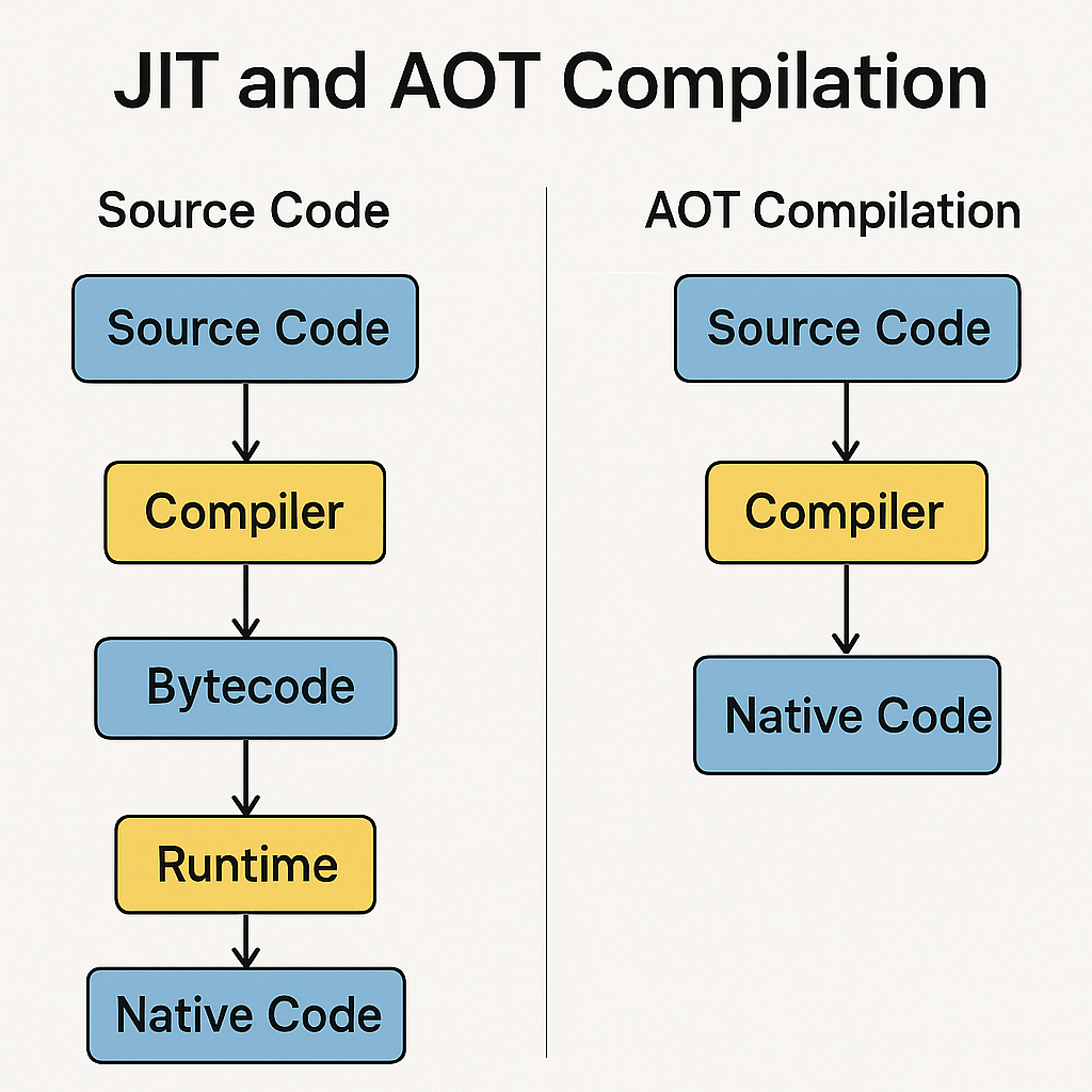
One of Dart’s most significant advantages is its versatile compilation technology. It uniquely employs both Just-in-Time (JIT) and Ahead-of-Time (AOT) compilation. During development, JIT compilation allows for incredibly fast development cycles with a feature called stateful hot reload, where code changes are injected into a running app in milliseconds. For production, Dart code is AOT-compiled into fast, predictable, native machine code. This dual-capability means developers get the best of both worlds: the rapid iteration speed of an interpreted language and the high performance of a compiled language, all within a single toolchain.
Another cornerstone of the language is its commitment to type safety and sound null safety. Sound null safety, integrated directly into the type system, helps developers avoid a whole class of common errors: the dreaded null pointer exceptions. By differentiating between nullable and non-nullable types, the compiler can catch potential errors before the code even runs. This not only leads to more stable and reliable applications but also allows the compiler to make optimizations that result in smaller and faster code, ensuring your applications are both robust and performant.
Getting Your Development Environment Ready
Getting started with Dart is a straightforward process. The first step is to install the Dart SDK, which you can download directly from the official Dart website. The SDK includes the compiler, a core set of libraries, and the dart command-line tool. For an optimal coding experience, we highly recommend using a modern editor like Visual Studio Code and installing its official Dart extension. This provides essential features like syntax highlighting, code completion, and debugging support. You will also quickly become familiar with the Pub.dev package manager, which is the official repository for Dart and Flutter packages, giving you access to thousands of reusable libraries.
Fundamental Dart Concepts with Examples
Variables and Data Types
At its heart, Dart is a strongly typed language, but it offers flexibility in how you declare variables. You can use the var keyword to let Dart infer the type, or you can be explicit. Key data types include int for integers, double for floating-point numbers, String for text, and bool for true/false values. Dart also provides two important keywords for variables that won’t change: final and const. A final variable can only be set once, while a const variable is a compile-time constant, meaning its value must be known when the code is compiled.
Keyword
Description
Example
var
A variable whose type is inferred and can be reassigned.
var name = 'Kodeco';
final
A single-assignment variable; once set, it cannot be changed.
final int year = 2024;
const
A compile-time constant; its value must be known at compile time.
const double pi = 3.14;
Beyond these primitives, Dart has powerful built-in support for collections, which are essential for managing groups of data. The two most common collection types you will use are List and Map. A List is an ordered collection of items, similar to an array in other languages. A Map is an unordered collection of key-value pairs, often called a dictionary or hash map. These collections are fundamental for structuring data in any non-trivial application and are deeply integrated into the language.
Functions: The Building Blocks of Logic
Functions are the primary way to organize and reuse code in Dart. A function is a self-contained block of code that performs a specific task. Dart functions can accept parameters and must specify a return type, though void is used if a function doesn’t return a value. For functions that contain just one expression, Dart provides a convenient arrow (=>) syntax, which is a shorthand way to define and return the result of that single expression. This helps keep your code clean, readable, and concise, especially when working with many small, single-purpose functions.
Control Flow Statements
To create dynamic and responsive applications, you need to control the flow of your program’s execution. Dart provides all the standard control flow statements you would expect from a modern language. You use if and else statements to execute code conditionally based on a boolean expression. For iteration, for loops are perfect for running a block of code a specific number of times, especially when iterating over collections like a List. For loops that should continue as long as a certain condition remains true, the while loop is the tool of choice.
A Glimpse into Object-Oriented Programming (OOP)
Dart is a true object-oriented programming (OOP) language, where everything, including numbers and functions, is an object. An object is an instance of a class, and a class acts as a blueprint for creating objects. Classes bundle data (properties or instance variables) and behavior (methods) into a single, cohesive unit. This paradigm is crucial for building complex, maintainable applications by modeling real-world entities. For example, you could create a Developer class with properties like name and skill and methods like writeCode(). For those looking to master this, we have a resource to help you explore [advanced object-oriented concepts in Dart](URL).
Why You Should Learn Dart Today
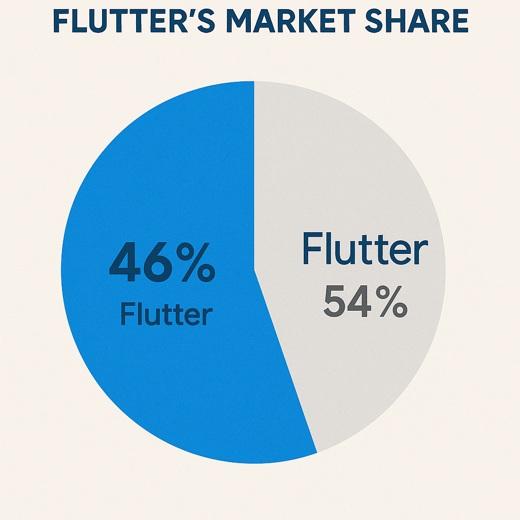
The single biggest reason to learn Dart is its inseparable link to Flutter. As the language powering Flutter, Dart is your gateway to building high-quality, natively compiled applications for mobile, web, and desktop from a single codebase. The demand for Flutter developers is skyrocketing. According to a 2023 Statista survey, Flutter is the most popular cross-platform mobile framework, used by 46% of software developers worldwide. Mastering Dart positions you at the forefront of this industry trend. You can get started by exploring the official [Flutter documentation](URL).
Beyond Flutter, Dart offers an exceptional developer experience. The language is designed to be productive and enjoyable. Features like the aforementioned stateful hot reload dramatically shorten the edit-test cycle, while its clean syntax and comprehensive standard library make writing code a pleasure. The built-in support for asynchronous programming with async and await makes handling complex operations like network requests simple and readable. If you’re ready for more, you can [deep dive into Dart's asynchronous programming](URL) with our specialized tutorials that cover these powerful features in detail.
Your Next Steps with Dart and Flutter
You’ve now seen a glimpse of what makes Dart a compelling language for modern application development. It offers an unmatched combination of developer productivity, multi-platform reach, and raw performance. Its thoughtful design, coupled with the power of the Flutter framework, provides a clear path for creating beautiful, fast, and consistent experiences across all devices. The journey from learning Dart basics to building sophisticated applications is incredibly rewarding. We encourage you to take the next step and begin your learning adventure today. To get on the fast track, explore [Our comprehensive Flutter learning path](URL), which is designed to guide you from foundational concepts to becoming a proficient Flutter developer.
The Versatility of Bootstrap Cards in Modern Web Design
Bootstrap cards are one of the most fundamental and versatile components in the entire framework. They serve as flexible containers for content, neatly packaging images, text, links, and buttons into a single, cohesive unit. In an era of component-driven development, cards are the building blocks for creating clean, organized, and responsive layouts. Whether you’re displaying a user profile, a product, a blog post summary, or a testimonial, the card component provides a consistent and recognizable UI pattern. Its inherent responsiveness ensures that these content blocks stack gracefully on smaller screens while arranging neatly into grids on larger viewports, making them indispensable for modern, mobile-first design strategies.
![Image: Responsive design showing Bootstrap cards on different devices]
Core Structure of a Bootstrap Card
At its heart, a Bootstrap card is built from a few key classes that work together. The primary wrapper is a div with the class .card. This element establishes the container with its default border, padding, and border-radius. Inside this wrapper, the most common element is the .card-body, which adds the necessary padding for your content. Within the body, you can structure your information semantically using classes like .card-title (typically applied to an
tag) and .card-text (for paragraph text). For visuals, an image with the class .card-img-top or .card-img-bottom can be placed directly inside the .card wrapper, before or after the .card-body, to create a clean, edge-to-edge image presentation. Understanding this basic anatomy is the first step toward mastering card customization, a topic we cover extensively in our comprehensive Bootstrap 5 Tutorial.
![Image: Anatomy of a Bootstrap Card with labeled components]
Practical Bootstrap Card Examples
Basic Card with Header and Footer
Beyond the basics, you can add structural context with headers and footers. By adding a div with the class .card-header or .card-footer within your main .card element, you can segment information effectively. Headers are perfect for displaying a title, category, or navigational tabs, while footers are commonly used for action buttons, last-updated timestamps, or supplemental links. These sections come with their own distinct styling, including a subtle background color and border, which helps them stand out from the main card body without additional CSS.
Image Overlays and Text Alignment
For a more visually striking presentation, Bootstrap allows you to place text directly over an image using the .card-img-overlay class. This technique is ideal for hero sections, banners, or portfolio items where the image is the primary focus. You apply this class to a div that contains your text elements, and place it inside the .card wrapper alongside the image. To ensure your text is legible, you might need to use Bootstrap’s color utilities, like .text-white, and consider adding a semi-transparent background overlay using custom CSS for better contrast. Furthermore, Bootstrap’s text alignment utilities, such as .text-center or .text-end, can be applied to the .card-body or overlay to precisely position your content.
![Image: A Bootstrap card with a dramatic image overlay and centered text]
Grouping Cards with Card Groups and Masonry
When you need to display multiple cards together, Bootstrap provides several powerful options. The .card-group class is an excellent choice when you want a set of cards to be of equal height and width, creating a uniform, connected grid. This is perfect for pricing tables or feature comparisons. For more dynamic, Pinterest-style layouts, a Masonry grid is the go-to solution. While older Bootstrap versions required a JavaScript library for this, modern CSS makes it much simpler. The 2022 Web Almanac by HTTP Archive reports that CSS Grid is now used by over 80% of both desktop and mobile sites, making it a first-class citizen for creating these complex layouts without extra JavaScript. You can now achieve a Masonry effect with Bootstrap’s grid system and a few CSS properties, a technique often demonstrated in tutorials.
Advanced Customization with Utilities
The true power of Bootstrap lies in its extensive library of utility classes, which allow for deep customization without writing a single line of custom CSS. You can easily modify a card’s appearance using these utilities. Add a splash of color with background classes like .bg-primary or .bg-light, and ensure text is readable with corresponding color utilities. Adjust spacing with margin (m-3) and padding (p-4) classes to give your components breathing room. You can even change border styles and colors using classes like .border-success and .border-2. Combining these utilities gives you granular control over every aspect of the card’s design, enabling you to match it perfectly to your site’s branding. This flexible approach is a core theme across all Bootstrap Examples.
Best Practices and Accessibility
Creating beautiful cards is only half the battle; they must also be accessible to all users. Start by using semantic HTML. The .card-title should always be a heading element (e.g.,
), which helps screen reader users navigate the content structure. For any image within a card that conveys information, always provide descriptive alt text. If the image is purely decorative, use an empty alt="" attribute. Color contrast is another critical factor. Ensure that your text has sufficient contrast against its background color to be readable by users with low vision. Tools like the WCAG Contrast Checker are invaluable for verifying your color choices meet accessibility standards.
Guideline
Implementation Example
Best Practice
Semantic Title
...
Use heading tags for titles to improve page structure.
Image Accessibility
Provide meaningful alt text for all informative images.
Color Contrast
.bg-dark .text-white
Check color pairs with a contrast tool to ensure AA/AAA compliance.
Putting It All Together: A Complete Example
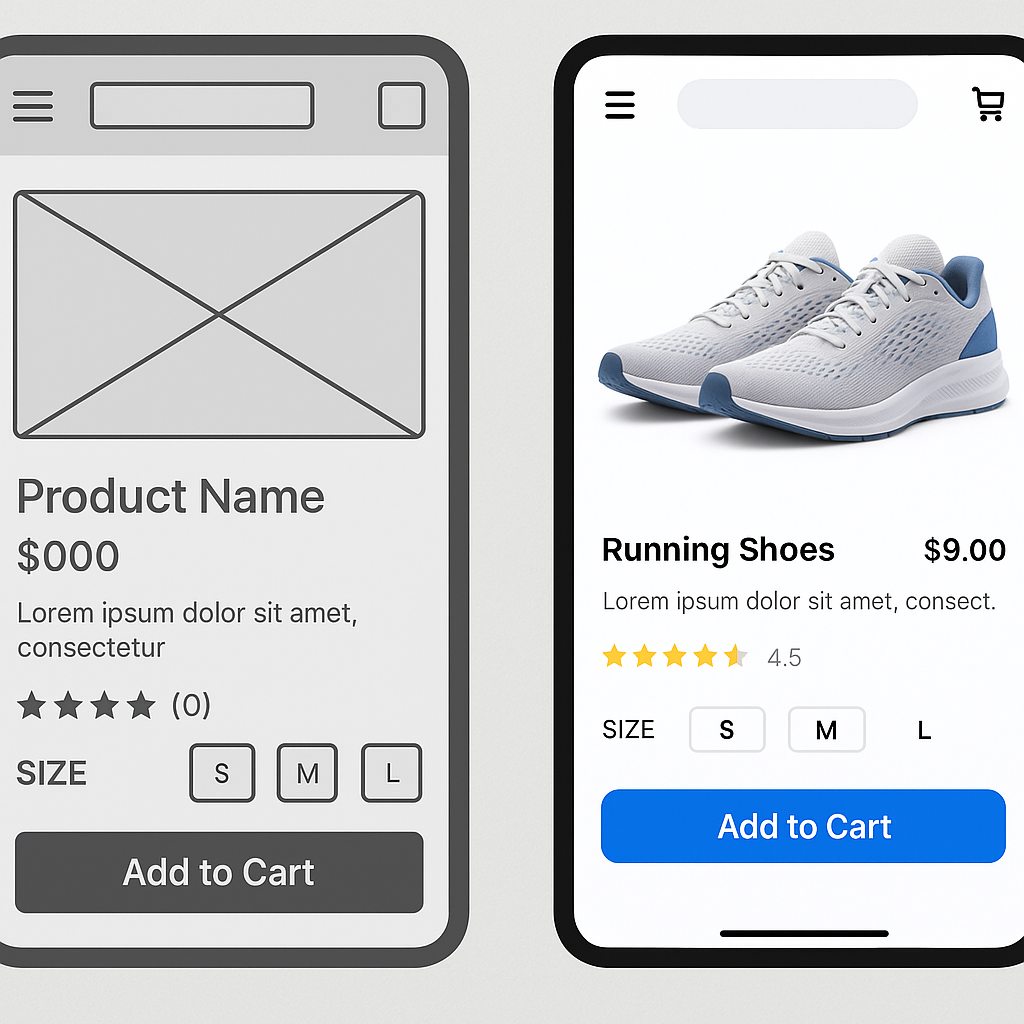
Let’s imagine building a product display for an e-commerce site. Each product would be in a .card. You would start with a .card-img-top for the product photo. Inside the .card-body, a
with .card-title would hold the product name, and a
with .card-text would give a brief description. You could add a pricing badge using Bootstrap’s badge component. The .card-footer could contain an “Add to Cart” button, styled with .btn .btn-primary. By placing several of these cards inside a responsive grid row, you create a clean, functional, and visually appealing product listing. This modular approach is precisely why developers rely on Bootstrap. For a deep dive into a similar structure, you can explore a complete Bootstrap 4 Card Example, as the core principles remain highly relevant.
Feature
Bootstrap Class
Purpose
Main Container
.card
Defines the card component.
Image
.card-img-top
Places an image at the top of the card.
Content Area
.card-body
Provides padding for text and other elements.
Action Area
.card-footer
A dedicated section for buttons or metadata.
![Image: A grid of fully-styled product cards on an e-commerce page]
As you can see, Bootstrap cards are far more than simple boxes. They are a robust, customizable, and essential tool for building modern, responsive web interfaces. From basic content containers to complex, interactive elements, the possibilities are nearly endless. We encourage you to start with these examples, experiment with different utility classes and structural combinations, and see how you can adapt them to fit your unique project needs. At ITSolutionStuff, we’re committed to providing the practical examples and in-depth tutorials you need to succeed.
The Ubiquitous Standard: Understanding JavaScript’s Role
JavaScript is the undisputed king of web development, a cornerstone technology that has powered the interactive web for decades. Its journey from a simple scripting language to a versatile powerhouse is remarkable. It runs natively in every modern web browser, making it the default choice for client-side logic. The rise of Node.js extended its reach to the server-side, creating a unified, full-stack development environment. This ubiquity has fostered an unparalleled ecosystem. Frameworks like React, Angular, and Vue.js dominate front-end development, offering structured ways to build complex user interfaces. According to the Stack Overflow 2023 Developer Survey, JavaScript remains the most commonly used programming language for the eleventh consecutive year, with 63.61% of developers using it. This massive community support means an endless supply of libraries, tutorials, and solutions to nearly any problem a developer might face. However, its original design as a dynamically typed language can sometimes be a double-edged sword, offering flexibility at the potential cost of runtime errors that could be caught earlier in development. For those starting out, understanding the fundamentals is key, and exploring JavaScript Best Practices for Beginners can set a strong foundation.
The Challenger from Google: What is Dart?
Emerging from Google, Dart was designed to be a “client-optimized language for fast apps on any platform.” Initially seen as a potential JavaScript replacement, its trajectory shifted significantly with the introduction of the Flutter framework. Today, Dart’s primary role is as the language powering Flutter, which enables developers to build beautiful, natively compiled applications for mobile, web, and desktop from a single codebase. This is its killer feature. Dart is a modern, object-oriented language that incorporates many features developers love, such as a robust statically typed system with sound null safety. This means the type system is reliable, and the compiler can prevent null pointer exceptions, a common source of bugs in other languages. Its flexible compilation strategy, offering both Just-in-Time (JIT) for development and Ahead-of-Time (AOT) for production, provides an excellent developer experience and high-performance applications. While its community is smaller than JavaScript’s, it’s passionate, growing rapidly, and strongly supported by Google. If you’re new to the language, Getting Started with Dart is the perfect place to begin your journey.
Head-to-Head Comparison
Performance and Compilation
When comparing performance, the compilation model is a key differentiator. JavaScript is traditionally an interpreted language, though modern browser engines use sophisticated Just-in-Time (JIT) compilers to optimize code execution on the fly. This makes it very fast for most web tasks. Dart, however, offers a dual approach. During development, it uses a JIT compiler, which is the magic behind Flutter’s popular Stateful Hot Reload feature, allowing developers to see changes in their app instantly. For production, Dart compiles Ahead-of-Time (AOT) to native machine code. This can lead to faster startup times and more consistently predictable performance, as the optimization work is done before the app ever runs.
Typing System
On the topic of typing, the contrast is stark. JavaScript is dynamically typed, meaning variable types are checked at runtime. This offers great flexibility but can lead to errors that only surface during execution. To combat this, the community widely adopted TypeScript, a superset of JavaScript that adds static types. Many developers consider TypeScript essential for large-scale application development, and you can learn more about it in resources from the official TypeScript website. Dart, on the other hand, was built from the ground up with static typing and sound null safety. Type errors are caught during compilation, not by your users, leading to more robust and maintainable codebases, especially as projects scale in complexity.
Ecosystem and Community
The ecosystem is where JavaScript’s age and dominance truly shine. Its package manager, npm (Node Package Manager), is the largest software registry in the world, offering a library for virtually any conceivable task. This vast selection is both a strength and a potential weakness, as navigating quality and security can be a challenge. JavaScript tooling is incredibly diverse but can also be fragmented, often requiring developers to manually configure linters, bundlers, and transpilers, a phenomenon sometimes called “JavaScript fatigue.” Dart’s ecosystem, centered around its package manager Pub.dev, is smaller but well-curated and growing steadily. The tooling experience is a major selling point. Dart comes with a comprehensive, built-in set of tools that handle formatting, analyzing, and building projects. When used with Flutter and an IDE like VS Code or Android Studio, the developer experience is exceptionally smooth and integrated. Features like the aforementioned hot reload are deeply embedded, making the development cycle fast and enjoyable.
Feature
JavaScript (via npm)
Dart (via Pub.dev)
Package Count
2.1+ Million
40,000+
Primary Use
General web, server, and tooling
Flutter apps, general-purpose
Backing
Broad open-source community
Google and open-source community
Tooling and Developer Experience
The developer experience can be subjective, but there are clear philosophical differences. The JavaScript ecosystem provides endless choice, empowering developers to construct their perfect development environment from scratch. This is powerful but can be daunting for newcomers. Dart and Flutter offer a more opinionated and integrated experience. The official tooling works out of the box, providing a consistent and highly productive environment, particularly for developers focused on cross-platform delivery. You can explore the rich ecosystem of Dart packages on the Pub.dev official site.
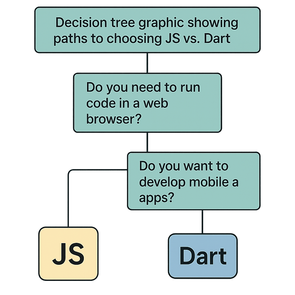
Use Cases: When to Choose Which
So, which language should you choose? The decision hinges entirely on your project’s requirements. JavaScript is the pragmatic choice for traditional web development. If you are building a content-heavy website, a standard e-commerce platform, or a single-page application where SEO and access to the largest possible library and talent pool are critical, JavaScript and its frameworks remain the undisputed champions. It is the path of least resistance for most web-centric projects. This decision is a crucial part of the overall process of Choosing the Right Programming Language for Web Development.
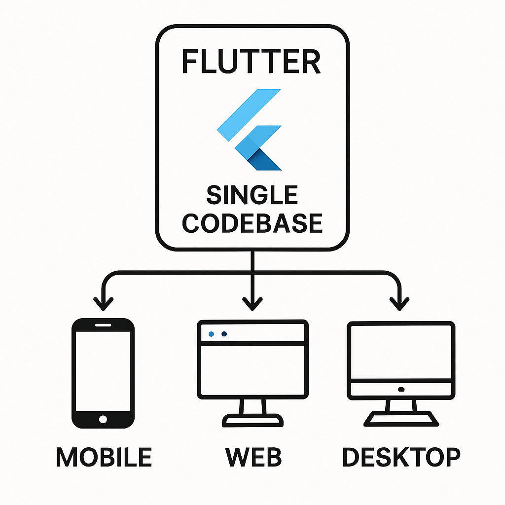
Dart, via Flutter, excels in cross-platform development. If your primary goal is to build an application for iOS, Android, and the web using a single codebase, Dart is an incredibly compelling option. It’s ideal for teams that want to maximize efficiency and maintain a consistent user experience across all platforms. It’s also a strong contender for complex, performance-intensive web applications where its AOT compilation and strong type system can provide a significant advantage. For a deeper dive into Flutter for web, the official Flutter documentation is an excellent resource.
Project Type
Recommended Language
Key Reason
SEO-critical Marketing Site
JavaScript
Native browser support, vast SEO tooling
Cross-Platform App (Mobile/Web)
Dart (with Flutter)
Single codebase efficiency
Large-Scale Enterprise Web App
JavaScript (with TypeScript)
Huge talent pool, mature ecosystem
Performance-Intensive Web Game
Dart (with Flutter)
AOT compilation, strong typing
The Future of Web Development
Ultimately, both are powerful tools in a developer’s arsenal. The web platform is evolving, and the choice between the established standard and a modern challenger depends on your specific goals. JavaScript’s position is secure, but Dart offers a compelling, modern alternative, especially within the Flutter ecosystem. The rise of technologies like WebAssembly may further level the playing field, allowing more languages to target the web with near-native performance. By understanding their core strengths and weaknesses, you can make an informed decision and build amazing applications, and Kodeco is here to help you master either path on your development journey.
The Modern Mobile App Development Lifecycle: A High-Level Overview
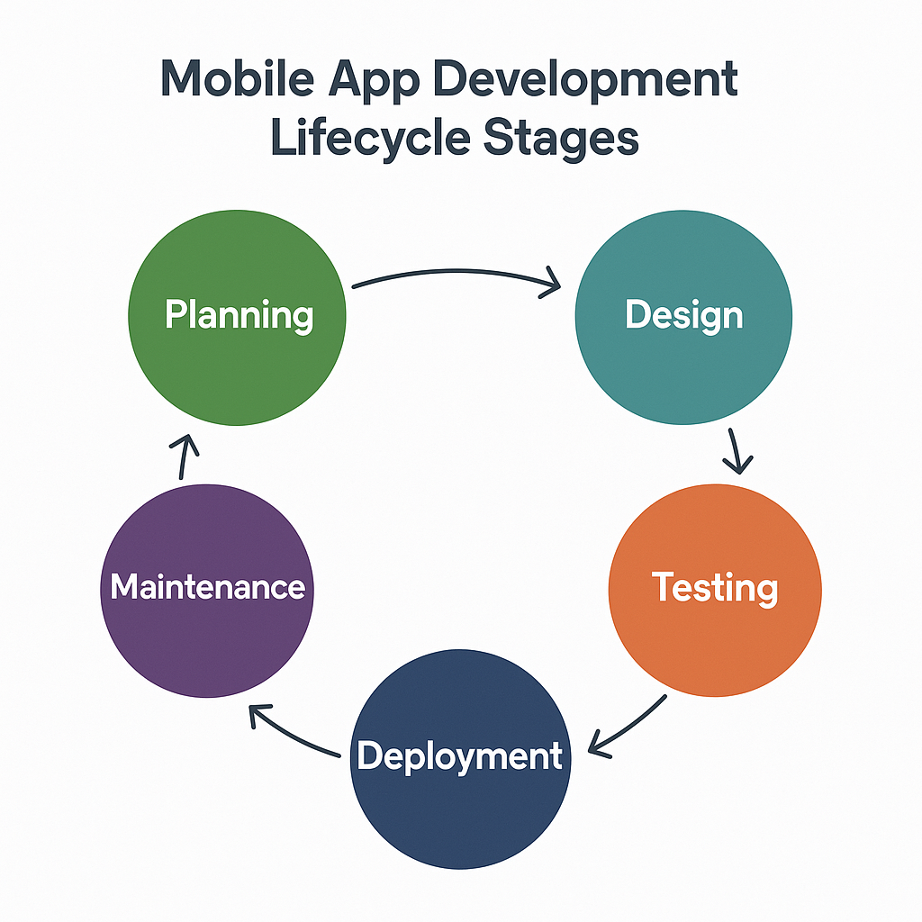
Embarking on the journey to create a mobile application is much like building a house. You wouldn’t start laying bricks without a detailed blueprint, a clear understanding of the land, and a plan for who will live there. Similarly, successful mobile apps are not born from a single flash of inspiration followed by frantic coding. They are the result of a structured, methodical process known as the mobile app development lifecycle. This lifecycle is a framework that guides a project from its initial idea to its launch and beyond, ensuring that the final product is well-conceived, robust, and meets the needs of its users. While traditional software development sometimes followed a rigid, sequential Waterfall model, the modern mobile landscape, characterized by rapid innovation and evolving user expectations, almost universally favors an Agile, iterative approach. This means the lifecycle isn’t a straight line but a continuous loop of building, testing, and learning. Each stage informs the next, and the entire process is designed for flexibility, allowing teams to adapt to new information and user feedback. Understanding these stages is the first and most critical step for any aspiring developer, project manager, or entrepreneur looking to make a mark in the competitive app marketplace. It provides the roadmap needed to navigate the complexities of app creation, manage resources effectively, and ultimately increase the chances of building an app that people love and use.
Stage 1: Discovery and Strategy
This foundational stage is all about asking the right questions before a single line of code is written. It’s where the core idea is scrutinized, refined, and validated against market realities. A brilliant concept is not enough; it must solve a real problem for a specific audience and have a viable path to success. Skipping or rushing this phase is a common reason why many apps fail to gain traction.
Defining the App’s Purpose and Goals
Every successful app begins with a clear value proposition. What specific problem does your app solve for its users? Is it simplifying a tedious task, providing entertainment, connecting people, or offering a service in a more convenient way? This purpose must be crystal clear. Alongside the user-centric goal, you must define the business objectives. Is the primary goal to generate direct revenue, enhance brand visibility, improve customer loyalty, or streamline internal business operations? These goals will dictate key decisions throughout the lifecycle. For example, an app designed to increase brand engagement might prioritize features that encourage social sharing, while an app focused on operational efficiency will emphasize speed, reliability, and integration with existing systems. A well-defined purpose acts as a North Star, guiding the entire team and ensuring every feature and design choice aligns with the overarching mission.
Market and Competitor Analysis
Once the “what” and “why” are established, it’s time to understand the landscape. This involves deep market research to identify and understand your target audience. Who are they? What are their demographics, behaviors, and technological preferences? Creating detailed user personas can bring this audience to life, helping the team empathize with future users. The next step is a thorough competitor analysis. Identify existing apps in your chosen niche. Download them, use them, and read their user reviews. What do they do well? Where do their weaknesses lie? The negative reviews are often a goldmine of information, revealing user pain points and feature gaps that your app can potentially fill. This analysis helps you find your unique selling proposition (USP)—the distinct feature or quality that will make your app stand out from the crowd. In a market with millions of apps, differentiation is not just an advantage; it’s a necessity. According to data.ai’s “State of Mobile 2024” report, mobile consumer spending is projected to reach a staggering $207 billion, highlighting the immense financial opportunity but also the fierce competition for user attention and dollars.
Feasibility and Monetization Strategy
The final piece of the discovery puzzle is a reality check. Technical feasibility assesses whether the app’s proposed features can be built with available technology, expertise, and resources. Are there any significant technical hurdles that could derail the project? Financial feasibility involves creating a preliminary budget, estimating development costs, and projecting potential return on investment (ROI). This is also the stage to decide on a monetization strategy. How will the app make money? Common models include a one-time purchase (paid), recurring payments (subscription), offering a basic version for free with premium features available for purchase (freemium), in-app purchases for digital goods, or generating revenue through in-app advertising. The chosen model will fundamentally influence the app’s design and user experience. For instance, a subscription-based app must continuously deliver high value to justify the recurring cost, whereas an ad-supported app needs to balance revenue generation with a non-intrusive user experience.
Stage 2: Planning and Prototyping
With a validated strategy in hand, the planning stage translates the abstract ideas from the discovery phase into a concrete and actionable blueprint. This is where the app’s structure, look, and feel begin to take shape, and critical technical decisions are made. It’s the bridge between a great idea and its tangible implementation.
Requirements Gathering and Feature Prioritization
This step involves documenting every detail of the app’s functionality. A Product Requirements Document (PRD) is often created, serving as a single source of truth for the development team. It outlines user stories, functional requirements, and technical specifications for each feature. However, it’s rarely feasible or wise to build every desired feature for the initial launch. This is where the concept of a Minimum Viable Product (MVP) becomes crucial. An MVP is the version of the app that includes just enough core features to be useful to early adopters and validate the main business idea. It allows you to get the product to market quickly, gather real-world user feedback, and iterate based on data rather than assumptions. To decide what goes into the MVP, teams often use prioritization techniques like the MoSCoW method. This framework categorizes features into Must-haves, Should-haves, Could-haves, and Won’t-haves (for the initial release), ensuring that development efforts are focused on what matters most.
Category
Description
Example (for a food delivery app)
Must-have
Critical for the app to function and be considered viable.
User registration, search restaurants, view menus, place an order.
Should-have
Important but not vital for launch. App will work without them.
Order tracking, saving favorite restaurants, user reviews.
Could-have
Desirable “nice-to-have” features if time and resources permit.
Social sharing of orders, dietary filtering, loyalty program.
Won’t-have
Features explicitly excluded from the current development scope.
In-app meal planning, catering requests.
User Experience (UX) and User Interface (UI) Design
This is where the app’s personality and usability are forged. While often grouped together, UX and UI design are distinct but interconnected disciplines. UX (User Experience) design is the science of making the app logical, intuitive, and easy to use. UX designers focus on the overall feel of the experience, creating the information architecture, user flows, and wireframes. A wireframe is a low-fidelity, black-and-white schematic that lays out the app’s structure and the placement of elements on each screen. UI (User Interface) design, on the other hand, is the art of making the app visually appealing. UI designers build upon the wireframes, defining the color palette, typography, iconography, and animations. They create high-fidelity mockups and interactive prototypes that look and feel like the final product. This allows stakeholders to test the user flow and provide feedback before development begins, which is far more cost-effective than making changes later in the process. Adhering to platform-specific guidelines, such as Google’s Material Design for Android and Apple’s Human Interface Guidelines for iOS, is essential for creating an experience that feels native and familiar to users. As modern UI development becomes more declarative, understanding how design translates to code is vital. The principles of modular design are directly reflected in frameworks that leverage the Lifecycle of Composables in Jetpack Compose.
Technology Stack Selection
The final pillar of the planning phase is choosing the right tools for the job. The technology stack is the combination of programming languages, frameworks, databases, and services used to build the app. This is a critical decision with long-term implications for scalability, performance, and maintenance costs. The first choice is the platform: native iOS, native Android, or a cross-platform solution. Native development (using Swift/SwiftUI for iOS and Kotlin/Jetpack Compose for Android) typically offers the best performance and deepest integration with the operating system. Cross-platform development frameworks like Flutter or React Native allow you to write code once and deploy it on both platforms, which can save time and money but may involve performance or feature limitations. The choice of the backend stack is equally important. This includes the server-side programming language (like Node.js, Python, or Go), the database (SQL like PostgreSQL or NoSQL like MongoDB), and the cloud infrastructure provider (such as Amazon Web Services, Google Cloud, or Microsoft Azure). For many projects, a Backend as a Service (BaaS) platform like Firebase can significantly accelerate development by providing pre-built solutions for authentication, databases, and file storage. If you are just starting, a Firebase Tutorial: Getting Started can be an invaluable resource to understand its potential.
Stage 3: Development and Implementation
This is the phase where the blueprints and designs from the previous stages are transformed into a tangible, working application. It is typically the longest and most resource-intensive stage of the lifecycle, where the core engineering work takes place. The development process itself is usually broken down into smaller, manageable cycles, especially when following an Agile methodology.
Setting Up the Development Environment
Before coding can begin, a robust infrastructure must be established to support the development team. This starts with setting up a version control system, with Git being the undisputed standard. Using platforms like GitHub, GitLab, or Bitbucket allows multiple developers to work on the same codebase simultaneously, track changes, and revert to previous versions if needed, which is essential for collaboration and code integrity. Alongside version control, teams use project management tools like Jira, Asana, or Trello to organize tasks, track progress, and manage workflows. These tools provide visibility into the project’s status and help keep everyone aligned. For modern, efficient teams, establishing a Continuous Integration and Continuous Deployment (CI/CD) pipeline is a best practice. CI/CD automates the process of building, testing, and deploying the app, allowing for faster and more reliable releases. Every time a developer commits code, the CI server can automatically build the app and run a suite of automated tests, catching bugs early and ensuring the codebase remains stable.
Frontend and Backend Development
The core of this stage is the actual coding, which is typically divided into two parallel streams: frontend and backend. Frontend development involves building the client-side of the application—everything the user sees and interacts with. Developers use the UI mockups and prototypes as a guide to implement the user interface, build out the navigation, and integrate the logic for user interactions. This is where the chosen technology stack, whether it’s native Swift/Kotlin or a cross-platform framework, comes into play. Backend development focuses on the server-side components that power the app. This includes building the server logic, setting up the database to store and retrieve data, and creating the Application Programming Interfaces (APIs). APIs act as the communication bridge between the frontend and the backend. For example, when a user signs up in the app, the frontend sends the user’s details to a specific API endpoint, and the backend processes this request, validates the data, and stores it in the database. These two streams of development must work in perfect harmony, requiring constant communication and well-defined API contracts to ensure seamless integration.
Importance of Clean Code and Architecture
Simply making an app work is not enough; how it is built matters profoundly. Writing clean, well-documented, and maintainable code is crucial for the long-term health of the project. A codebase that is difficult to understand will be challenging to debug, update, and scale. This is where software architecture patterns come in. Architectures like Model-View-ViewModel (MVVM) or Model-View-Intent (MVI) provide a structured way to organize code, separating concerns and making the application more robust and testable. A well-architected app is easier to modify, as changes in one part of the system are less likely to break another. It also simplifies the process of onboarding new developers to the team. Investing time in good architecture and clean code practices during the development stage pays significant dividends down the line, reducing technical debt and making it easier to add new features and adapt to future requirements. There are many resources available to help developers master these concepts, such as this guide on Clean Architecture for Android.
Stage 4: Testing and Quality Assurance
Once the initial development is complete, the application enters the critical Quality Assurance (QA) stage. The goal here is to find and fix as many bugs, inconsistencies, and performance issues as possible before the app reaches the end-user. A buggy or unstable app can quickly lead to negative reviews, high uninstall rates, and irreparable damage to the brand’s reputation. Thorough testing is not a one-time event but an ongoing process that should be integrated throughout development. It ensures the app is stable, performs well, is secure, and provides the seamless user experience that was envisioned during the design phase.
Types of Mobile App Testing
A comprehensive QA strategy involves multiple types of testing to cover all aspects of the application’s quality. Functional testing is the most basic type, verifying that each feature of the app works according to the requirements specified in the PRD. Does tapping this button do what it’s supposed to do? Does this form submit correctly? Usability testing goes a step further, evaluating how easy and intuitive the app is to use, often by observing real users as they try to complete tasks. Performance testing is crucial for mobile apps; it measures key metrics like app launch time, responsiveness, battery consumption, and memory usage. An app that drains the battery or feels sluggish will quickly be abandoned. Compatibility testing ensures the app works correctly across a wide range of devices, screen sizes, operating system versions, and network conditions. This is particularly challenging in the fragmented Android ecosystem. Finally, security testing is paramount for protecting user data. It involves looking for vulnerabilities that could be exploited by malicious actors, such as insecure data storage or unencrypted data transmission. Awareness of the underlying system, such as the Android Lifecycle, is critical for writing effective tests that account for how the OS manages an app’s state.
Testing Type
Primary Goal
Key Questions
Functional
Verify features work as specified.
Does this button lead to the correct screen?
Usability
Ensure the app is intuitive and user-friendly.
Can a new user figure out how to complete a core task?
Performance
Check for speed, stability, and resource usage.
How much battery does the app use? Does it lag on older devices?
Compatibility
Ensure consistent operation across devices/OS.
Does the layout look correct on a small phone and a large tablet?
Security
Identify and fix vulnerabilities.
Is sensitive user data encrypted both at rest and in transit?
The Role of Automated vs. Manual Testing
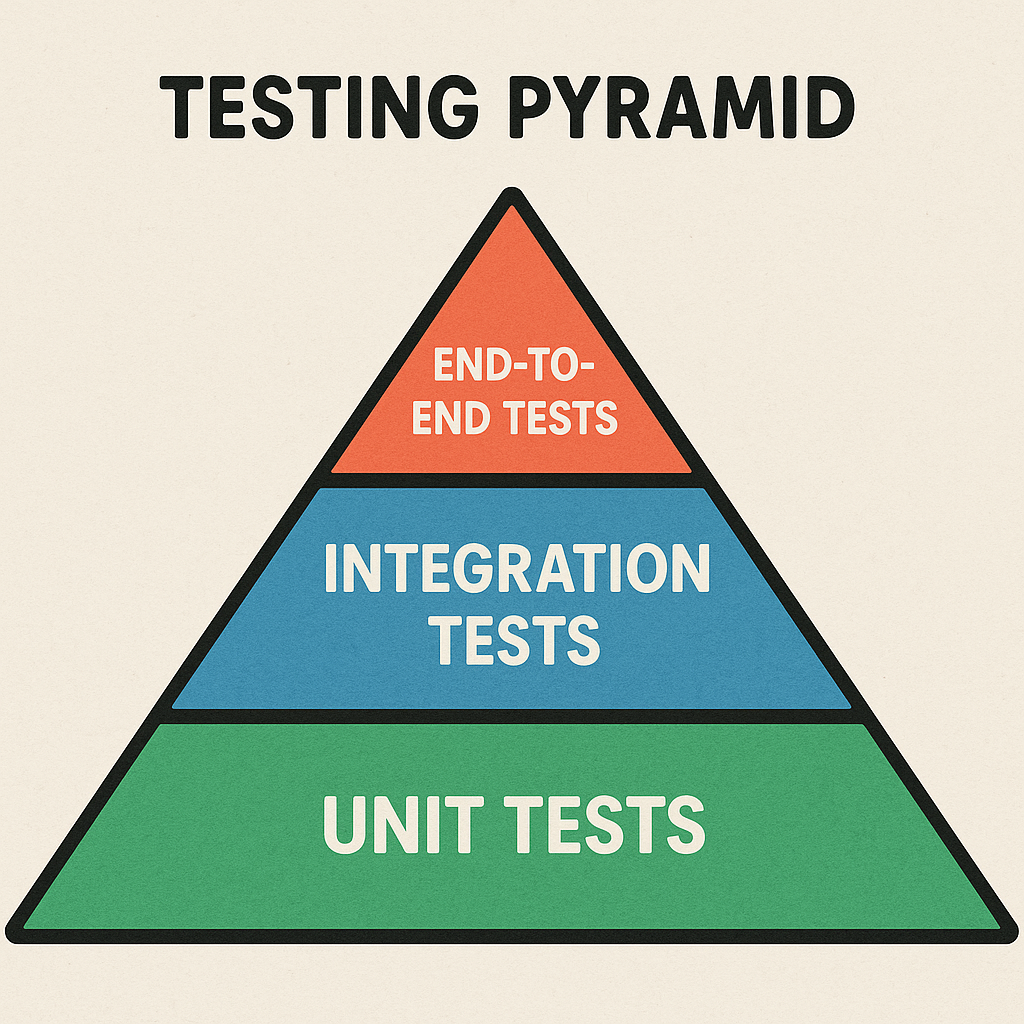
The testing process typically employs a mix of manual and automated approaches. Manual testing involves human testers who interact with the app like a real user would. They follow test cases to check functionality but can also perform exploratory testing, where they use their intuition and experience to uncover unexpected bugs and usability issues. This human element is invaluable for assessing the overall user experience. Automated testing, on the other hand, uses scripts and software to execute tests automatically. This includes unit tests, which check individual components or functions of the code in isolation, and UI tests, which simulate user interactions to verify the interface behaves as expected. While automated tests require an initial investment to write, they can be run quickly and repeatedly, making them perfect for regression testing—ensuring that new code changes haven’t broken existing functionality. The most effective QA strategies find the right balance, using automation for repetitive, predictable checks and reserving manual testing for usability, exploratory, and more complex scenarios.
Stage 5: Deployment and Launch
After rigorous development and testing, the app is finally ready to be released to the world. The deployment stage involves preparing the application for submission to the app stores and executing a well-planned launch strategy. This is a moment of truth, where the app transitions from a development project to a live product in the hands of users. Careful planning is essential to ensure a smooth and successful debut.
Preparing for App Store Submission
Getting an app onto the Google Play Store and the Apple App Store is a process in itself. Each platform has its own set of detailed guidelines and a review process that your app must pass. This requires creating a compelling app store listing. Key elements include a unique and memorable app icon, high-quality screenshots and video previews that showcase the app’s functionality, and well-written promotional text and descriptions. App Store Optimization (ASO) is the practice of strategically choosing keywords for your app’s title and description to improve its visibility in store search results. It’s crucial to thoroughly read and understand the store guidelines to avoid rejection. For example, Apple’s App Store Review Guidelines are famously strict, with a strong focus on security, privacy, and user experience. Recently, policies like Apple’s App Tracking Transparency (ATT) framework have become a critical consideration for any app that uses advertising or analytics, requiring explicit user consent for tracking. Failing to comply with these rules can lead to lengthy delays or outright rejection, so it’s vital to do your homework. To stay current, it’s always best to review Apple’s latest guidelines directly.
The Launch Process
A “big bang” launch where the app is released to everyone at once can be risky. If an unexpected critical bug surfaces, it could affect your entire initial user base. To mitigate this risk, many developers opt for a more controlled rollout. Beta testing is a common first step, where the app is released to a limited group of users through platforms like Apple’s TestFlight or the Google Play Console’s beta tracks. This allows you to gather final feedback and catch last-minute issues in a real-world environment. Following a successful beta, a phased rollout is a smart strategy. Both Google Play and the App Store allow you to release the app to a small percentage of users initially (e.g., 1%) and gradually increase the percentage over several days. This approach lets you monitor performance and stability closely, and if a major problem arises, you can pause the rollout, fix the issue, and resume without impacting all users. The launch itself should be supported by a marketing plan to generate initial buzz and drive downloads, which could include social media campaigns, press outreach, or paid advertising.
Stage 6: Post-Launch Maintenance and Iteration
The journey of a mobile app is far from over once it’s launched. In many ways, this is just the beginning. The post-launch phase is a continuous cycle of monitoring, supporting, and improving the app based on real-world data and user feedback. Successful apps are not static; they evolve over time to meet changing user needs, adapt to new technologies, and stay ahead of the competition. This final stage brings the lifecycle full circle.
Monitoring and Analytics
Once the app is live, it’s essential to track its performance meticulously. This involves setting up analytics tools to monitor Key Performance Indicators (KPIs). Services like Google Analytics for Firebase or Mixpanel can provide deep insights into user behavior. Important metrics to watch include the number of downloads, Daily and Monthly Active Users (DAU/MAU), user retention and churn rates, session length, and conversion rates for your key goals. Equally important is crash reporting and performance monitoring. Tools like Sentry or Firebase Crashlytics can alert you in real-time when your app crashes or experiences performance issues, allowing you to proactively identify and fix problems before they affect a large number of users. This data-driven approach is fundamental to making informed decisions about the app’s future direction.
User Feedback and Support
Your users are your most valuable source of information for improving your app. It’s crucial to establish clear channels for them to provide feedback and receive support. This starts with actively monitoring app store reviews. Respond to both positive and negative reviews professionally; thank users for their praise and acknowledge the issues raised in critical feedback. This shows that you are listening and care about their experience. Beyond the app stores, monitor social media channels and consider creating a dedicated support email or in-app feedback form. Every piece of user feedback, whether it’s a bug report, a feature request, or a general complaint, is an opportunity to improve. This feedback should be systematically collected, categorized, and used to inform the product backlog for future updates.
Continuous Updates and Feature Enhancements
The insights gathered from analytics and user feedback fuel the ongoing development cycle. The post-launch phase is a perpetual loop of the earlier lifecycle stages, just on a smaller scale. You will continuously be planning new features, designing UX/UI improvements, developing them, testing them, and deploying them as updates. This iterative process is what keeps an app relevant and successful over the long term. The work involves not only adding exciting new features but also performing essential maintenance. This includes fixing bugs discovered after launch, ensuring the app remains compatible with new operating system versions from Apple and Google, and refactoring code to improve performance and reduce technical debt. By embracing this cycle of continuous improvement, you transform a one-time product launch into a dynamic, evolving service that builds a loyal user base and achieves lasting success.
Navigating the mobile app development lifecycle requires a blend of strategic thinking, technical expertise, and a deep commitment to the user. Each stage, from the initial spark of an idea to the ongoing process of maintenance and iteration, plays a vital role in shaping the final product. By understanding and respecting this structured process, you can transform a great idea into a high-quality, successful mobile application. Whether you are just beginning your journey in mobile development or looking to refine your process, Kodeco is here to support you at every stage with expert-led courses, books, and tutorials designed to build your skills and confidence.
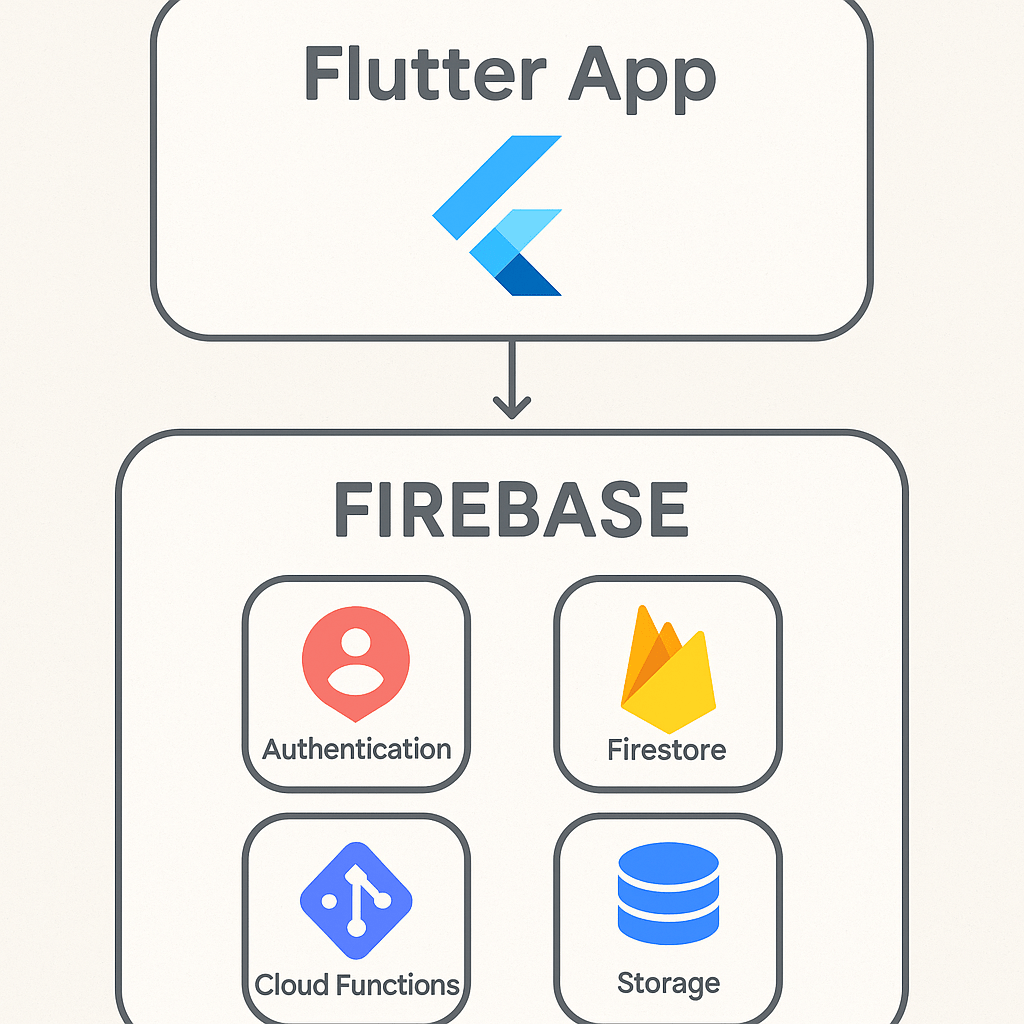
Why Firebase is a Game-Changer for Flutter Developers
For developers aiming to build powerful, scalable applications with impressive speed, the combination of Flutter and Firebase is nothing short of revolutionary. Flutter, Google’s UI toolkit, allows for the creation of natively compiled applications for mobile, web, and desktop from a single codebase. Firebase, also a Google product, is a comprehensive Backend-as-a-Service (BaaS) platform that handles the server-side complexities so you can focus on creating an amazing user experience. This dynamic duo significantly reduces development time and resources. Instead of building your own backend infrastructure for features like user authentication, databases, file storage, and analytics, you can simply plug into Firebase’s robust, managed services. The BaaS market is expanding rapidly, with a 2023 report from MarketsandMarkets projecting its growth to USD 28.1 billion by 2028, a testament to the efficiency it brings to projects. By integrating Firebase, you empower your Flutter app with a secure, scalable, and real-time backend, transforming a simple frontend application into a full-stack powerhouse.
Setting Up Your Firebase Project
Getting started is a straightforward process that begins in the Firebase console. This initial setup establishes the connection between your application and the suite of services you intend to use. It’s a foundational step that every developer must complete before writing a single line of integration code.
Creating the Firebase Project
First, navigate to the Firebase console and sign in with your Google account. You’ll see an option to “Add project.” Clicking this will launch a simple, three-step wizard. You will be prompted to enter a name for your project, which should be unique and descriptive. Next, you can choose whether to enable Google Analytics for your project. We highly recommend keeping this enabled, as it provides invaluable insights into user engagement and app performance right out of the box. Once you’ve confirmed these settings, Firebase will provision your project, which typically takes less than a minute. You’ll then be redirected to your new project’s dashboard, the central hub for managing all your Firebase services.
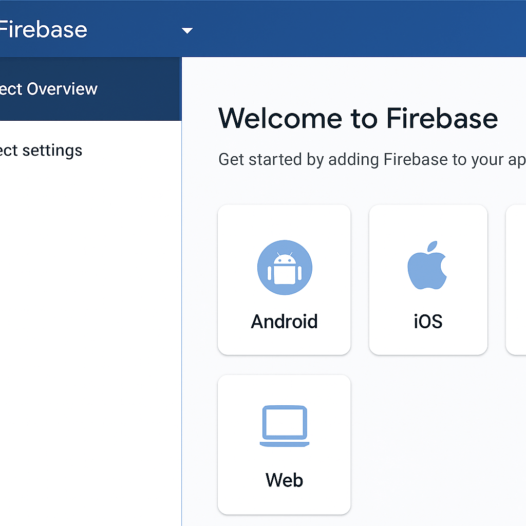
Registering Your Flutter App
With your project ready, you need to tell Firebase about the specific application that will be connecting to it. On the project dashboard, you will see icons for different platforms: iOS, Android, Web, and Unity. You’ll need to register each platform your Flutter app will support. For Android, you’ll need to provide your app’s package name, which can be found in your android/app/build.gradle file under the applicationId field. For iOS, you’ll provide the iOS bundle ID from your Xcode project settings. After providing this information, Firebase will generate configuration files for you: google-services.json for Android and GoogleService-Info.plist for iOS. Download these files, as you’ll need them in the next stage of the integration.
Integrating the Firebase SDK into Your Flutter App
Now it’s time to bring Firebase into your Flutter codebase. This involves adding the necessary software development kits (SDKs) to your project and initializing the connection when your app starts.
Adding Dependencies
Flutter manages packages through the pubspec.yaml file, located in your project’s root directory. The most critical package is firebase_core, which enables the core functionality and connection to your Firebase project. You will also add packages for the specific Firebase services you want to use, such as cloud_firestore for the database or firebase_auth for user authentication. You can find all the officially supported plugins on the pub.dev repository. After adding the package names and versions to your pubspec.yaml file, run the flutter pub get command in your terminal to download and install them into your project.
Before you can make any calls to Firebase services, you must initialize the connection. This is typically done in your main.dart file before you run the application. The initialization process is asynchronous, so your main function will need to be marked with the async keyword. You must call WidgetsFlutterBinding.ensureInitialized() to ensure the Flutter engine is ready, followed by await Firebase.initializeApp(). This single line of code uses the configuration files you downloaded earlier to establish a secure connection to your Firebase backend. This setup is a foundational step in our comprehensive Flutter learning path.
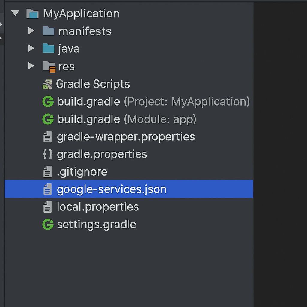
Platform-Specific Configuration
The final step is placing the platform-specific configuration files in the correct locations within your Flutter project. For Android, place the google-services.json file inside the android/app/ directory. You will also need to apply the Google Services Gradle plugin by making small modifications to your android/build.gradle and android/app/build.gradle files. For iOS, the process involves opening your project’s ios folder in Xcode and dragging the GoogleService-Info.plist file into the Runner subfolder, ensuring it’s added to the Runner target.
Platform
Configuration File
Location
Android
google-services.json
android/app/
iOS
GoogleService-Info.plist
ios/Runner/
A Practical Example: Implementing Firebase Authentication
Let’s make this tangible with a common use case: user sign-up. Firebase Authentication provides a secure and easy-to-implement solution for managing users. After adding the firebase_auth dependency, you can create a function that handles new user registration with just a few lines of code. You can create an instance of FirebaseAuth and call the createUserWithEmailAndPassword method, passing the user’s desired email and password. This method returns a Future containing user credentials upon success or throws an exception if the email is already in use or the password is too weak. This simple yet powerful feature is a cornerstone for building personalized app experiences.
Authentication is just the beginning. The true power of this integration comes from combining multiple services. Cloud Firestore is a flexible, scalable NoSQL cloud database that allows for real-time data synchronization. Storing and retrieving data is as simple as referencing a collection and calling add() or get() methods. For user-generated content like profile pictures or videos, Cloud Storage provides robust and secure file storage. When you need custom backend logic, like processing a payment or sending a welcome email after a user signs up, Cloud Functions lets you run serverless code in response to events triggered by Firebase features. Managing data from Firebase often requires you to dive deeper into Flutter state management.
As you build out your application, it’s crucial to implement security rules for both Firestore and Cloud Storage. These rules live on the Firebase servers and define who has read or write access to your data, protecting it from unauthorized use. Additionally, familiarize yourself with the Firebase Pricing Page to understand the generous free tier and the pay-as-you-go model, allowing you to manage costs effectively as your app grows. With Firebase fully integrated, you are now equipped to build scalable, feature-rich applications that can delight users and compete in today’s market. To take your UI to the next level, why not explore advanced Flutter animations?
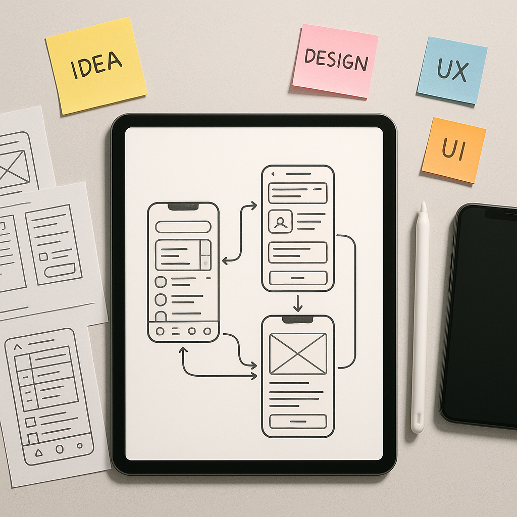
Every groundbreaking mobile app begins not with code, but with an idea. However, an idea is abstract and fragile. To give it form, to test its assumptions, and to communicate its vision effectively, you need a prototype. A prototype is far more than a simple sketch; it’s an interactive, functional model of your app that simulates the end-user experience. It allows stakeholders, potential users, and your development team to see, touch, and navigate your concept long before significant engineering resources are committed. This process is not a mere formality; it is a critical strategic step that de-risks your project. By building a tangible representation of your app, you can validate your core concept, test usability with real people, and uncover design flaws when they are still easy and inexpensive to fix. The cost of correcting an error during the design phase is a fraction of what it would be post-launch. A report from the Systems Sciences Institute at IBM highlighted that fixing a bug after release can be four to five times more expensive than addressing it during design, a cost that can skyrocket during long-term maintenance. A prototype acts as your primary tool for early-stage quality assurance, ensuring the product you eventually build is one that users will actually want and understand.
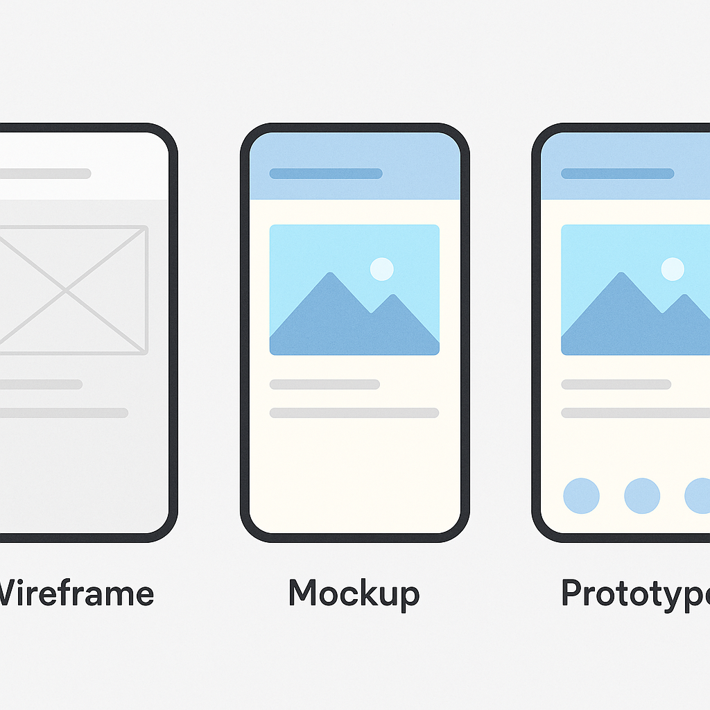
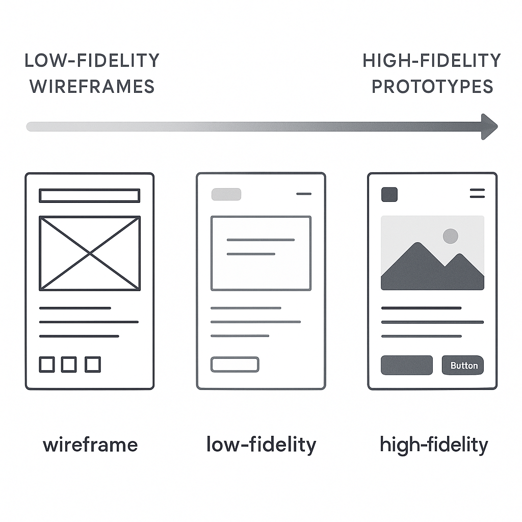
The world of prototyping is not monolithic; it exists on a spectrum of fidelity, which refers to how closely the prototype resembles the final product in terms of visual detail and interactivity. At one end, you have low-fidelity (lo-fi) prototypes. These are often digital wireframes linked together, focusing purely on structure, user flow, and layout without the distraction of colors, fonts, or branding. They are quick to create and perfect for testing the fundamental logic of your app’s navigation. In the middle sits mid-fidelity (mid-fi), which adds a bit more detail, perhaps some grayscale UI elements and more defined content placeholders. At the other end is the high-fidelity (hi-fi) prototype. This version looks and feels almost indistinguishable from the final app. It incorporates detailed UI design, branding, realistic content, complex animations, and micro-interactions. The choice of fidelity depends on your goal. Early-stage idea validation calls for the speed and flexibility of lo-fi, while late-stage user testing or investor pitches demand the realism and polish of a hi-fi prototype. Understanding this spectrum is the first step toward choosing the right approach for your specific needs at each stage of the product development lifecycle.
Laying the Foundation: Pre-Prototyping Essentials
Define Your Core Idea and User Persona
Before you can build a model of your app, you must have a crystal-clear understanding of what it is and who it is for. This foundational step is often rushed but is arguably the most important. Start by articulating a concise problem statement. What specific pain point are you solving for your users? A vague goal like “making a social media app” is a recipe for a bloated, unfocused product. A better problem statement might be, “Professionals in creative fields need a way to quickly create and share a portfolio of their work from their mobile device to respond to time-sensitive job opportunities.” This clarity guides every subsequent decision. Once the problem is defined, you must deeply understand the people who experience it. This is where user personas come into play. A user persona is a detailed, semi-fictional character profile that represents your ideal user. It goes beyond simple demographics like age and location to include their goals, motivations, frustrations, and technical proficiency. For our portfolio app, a persona might be “Chloe, a 28-year-old freelance graphic designer who is often on the go and needs to showcase her latest work to potential clients with minimal friction.” When you design for Chloe, you are no longer designing for an abstract “user” but for a person with specific needs and behaviors, leading to more empathetic and effective design choices.
Map Out User Flows and Key Features
With a clear problem and a target user in mind, the next step is to map out the journey they will take within your app. A user flow is a visual representation of the path a user follows to accomplish a specific task, from their entry point to the final action. For Chloe, a critical user flow would be “Adding a new project to her portfolio.” This flow would include steps like tapping ‘Add New’, selecting images or videos from her phone, adding a title and description, and publishing the project. Mapping these flows, often as simple diagrams with boxes and arrows, forces you to think through the logical sequence of screens and actions. It helps identify potential dead ends, confusing steps, or missing functionality before you’ve invested time in detailed design. This process naturally leads to a list of required features. To avoid feature creep, it’s crucial to prioritize. A common method is to categorize features into must-haves, should-haves, could-haves, and won’t-haves. This helps define your Minimum Viable Product (MVP)—the version of your app with just enough features to be usable by early customers who can then provide feedback for future product development. Creating a simple feature prioritization matrix can bring immense clarity to your project’s scope and ensure you are building the most impactful elements first, saving more complex or “nice-to-have” features for later iterations.
Feature
Priority (High/Med/Low)
Justification
User Account Creation
High
Core requirement for personalized portfolio management.
Upload Project (Image/Video)
High
The primary function of the app.
Edit Project Details
High
Allows users to manage and update their content.
| Social Media Sharing | Medium | Expands reach but is not critical for initial portfolio creation. |
| In-App Messaging | Low | A complex feature that can be added in a later version. |
Sketching and Wireframing: The Blueprint
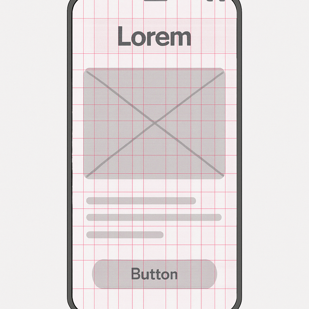
The transition from abstract flows to tangible screens begins with sketching. Sketching is the fastest way to explore different layout ideas. Using nothing more than a pen and paper, you can generate dozens of variations for a single screen in minutes. The goal here is not to create a work of art but to externalize your thoughts and experiment with the placement of key elements like buttons, images, and text. This low-cost, high-speed exploration phase is invaluable for creative problem-solving. Once you have a few promising sketches, you move on to wireframing. A wireframe is a digital, structural blueprint of your app. It’s a clean, grayscale representation that focuses exclusively on layout, information hierarchy, and functionality. By deliberately omitting colors, fonts, and images, wireframes force you and your stakeholders to focus on the core user experience and structure. Is the primary call-to-action clear? Is the navigation intuitive? Is the information organized logically? These are the questions wireframes help answer. They serve as the skeletal framework upon which you will build your interactive prototype. Many developers and designers find that solidifying these fundamentals early on prevents major structural changes down the line, and you can learn more by exploring some fundamental Mobile UX Design Tips & Tricks to inform your layouts.
The Prototyping Process: From Static to Interactive
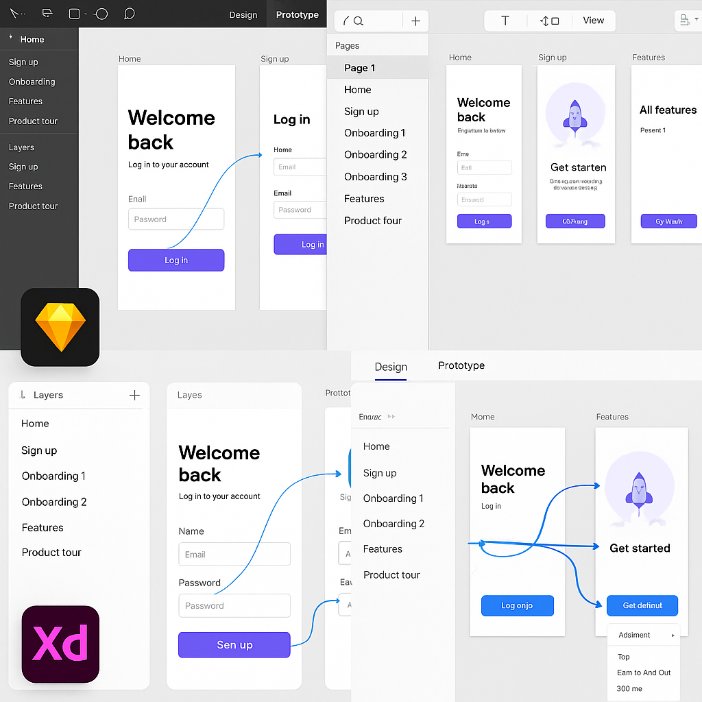
Choosing Your Prototyping Tool
With your wireframes ready, it’s time to select the tool that will bring them to life. The market is filled with excellent options, each with its own strengths, so the right choice depends on your project’s needs, your team’s skills, and your desired level of fidelity. The most popular category includes design-focused tools like Figma, Sketch, and Adobe XD. These applications excel at creating visually stunning user interfaces and then adding interactive links between screens to simulate user flows. They are relatively easy to learn and are built for collaboration. According to a 2023 survey by UXTools.co, Figma has cemented its position as the dominant force, with nearly 80% of designers using it as their primary UI design tool. Its real-time collaboration and browser-based accessibility make it a favorite for teams of all sizes. For those seeking even higher fidelity, there are code-based or advanced prototyping tools like Framer and Origami Studio. These platforms allow you to create more sophisticated animations, intricate micro-interactions, and data-driven prototypes that feel incredibly realistic. They often have a steeper learning curve as they may require some knowledge of code or logic-based systems, but they provide unparalleled power for fine-tuning the user experience. If you’re interested in exploring this more powerful tier of tools, a great place to start is an Origami Studio Tutorial for Mobile Prototyping: Getting Started, which can introduce you to the node-based logic that drives its advanced interactions. Your choice of tool will define your workflow, so consider factors like collaboration features, platform compatibility (macOS vs. Windows), pricing, and the specific interactive capabilities you’ll need.
Tool
Best For
Learning Curve
Pricing Model
Figma
Collaborative UI design, all-around prototyping
Low
Freemium
Adobe XD
Integration with Adobe Creative Cloud
Low-Medium
Subscription
Sketch
macOS native UI design, robust plugin ecosystem
Low-Medium
Subscription
Framer
High-fidelity, code-based prototypes, web integration
Medium-High
Freemium
Building Your Low-Fidelity (Lo-Fi) Prototype
Your first interactive prototype will likely be a low-fidelity one. The process involves importing your static wireframes into your chosen tool and then creating “hotspots” or links that connect the different screens. For example, you would draw a hotspot over a “Login” button on the home screen and link it to the “Login” screen artboard. By repeating this process for all the interactive elements in your user flow—buttons, navigation tabs, list items—you create a clickable, navigable path through your app. This lo-fi prototype doesn’t have the final visual design, but it has the functional soul of the application. The primary purpose of this stage is to test the core information architecture and user flow. Can a user successfully navigate from point A to point B without confusion? Does the flow make logical sense? Are there any glaring gaps or dead ends? Because you haven’t invested time in detailed visual design, feedback at this stage is focused entirely on functionality and structure. It’s also incredibly easy to make changes. If testing reveals a confusing step, you can simply reroute a link or adjust a wireframe layout in minutes, rather than overhauling a fully designed screen. This agility is the key strength of lo-fi prototyping, allowing for rapid iteration and validation of the app’s fundamental blueprint. For a deeper dive into this concept, the Nielsen Norman Group offers an excellent breakdown of Low-Fidelity vs. High-Fidelity Prototyping.
Crafting the High-Fidelity (Hi-Fi) Prototype
Once your user flows are validated with a lo-fi prototype, it’s time to elevate it to high fidelity. This is where you transform the structural blueprint into something that looks and feels like a real, polished application. This stage involves applying the final UI design, which includes the color palette, typography, iconography, and branding elements. You’ll replace the grayscale boxes and placeholder text of your wireframes with detailed components, realistic imagery, and actual copy. A rich source for pre-made and customizable design assets can be found on marketplaces like UI8 – Curated Design Resources, which can significantly speed up the UI design process. But a hi-fi prototype is more than just a collection of beautiful static screens. Its defining characteristic is its advanced interactivity. This means adding subtle micro-interactions, such as a button changing color on press or a satisfying animation when an item is added to a cart. It also involves creating smooth screen transitions, like sliding panels or modal pop-ups, that mimic the behavior of a native application. Modern prototyping tools make it possible to implement these details without writing code, using features for smart animation, component states, and conditional logic. The goal is to create an experience so immersive that users might forget they aren’t using a finished product. This level of realism is essential for final usability testing, stakeholder presentations, and for providing developers with an unambiguous reference for how the app should behave.
Testing and Iterating: The Feedback Loop
Conducting Usability Testing
A prototype, no matter how beautiful or well-crafted, is built on a series of assumptions. The only way to validate these assumptions is to put it in front of real users. Usability testing is the practice of observing people as they attempt to complete tasks using your prototype. The goal is to identify areas of friction, confusion, and frustration in the user experience. Your test participants should ideally be representative of your target audience—the people you defined in your user personas. You can recruit them from your existing network, social media groups, or dedicated user testing platforms. The testing sessions themselves can be moderated, where a facilitator guides the user and asks follow-up questions, or unmoderated, where the user completes tasks on their own while their screen and voice are recorded. A key technique in either format is to encourage participants to use the “think aloud” protocol, where they verbalize their thoughts, expectations, and reactions as they navigate the prototype. This provides invaluable qualitative insight into their mental model. You are not looking for compliments on your design; you are hunting for problems. Pay close attention to where they hesitate, what they click on that isn’t interactive, and whether they can successfully complete the key tasks you designed the flows for. Comprehensive resources like Maze’s Guide to Usability Testing can provide structured methodologies for planning and executing effective tests.
Gathering Feedback and Refining Your Design
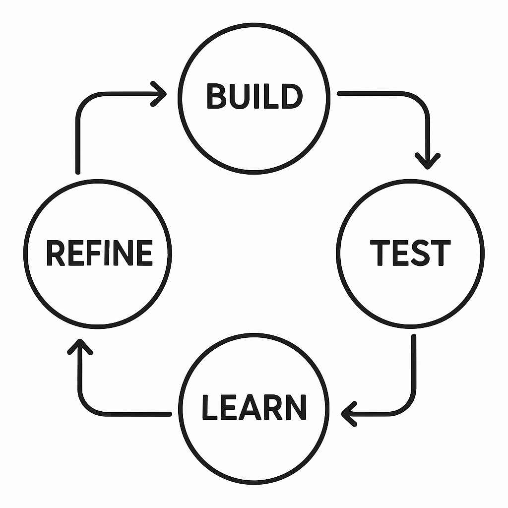
After completing a round of usability tests, you will be left with a wealth of data—recordings, notes, and observations. The next crucial step is to synthesize this feedback to find actionable insights. It’s important to look for patterns and recurring themes rather than getting sidetracked by one-off comments. If three out of five testers struggled to find the settings menu, that’s a clear signal that its placement or labeling is a problem. If only one person mentioned they disliked a specific color, it might be a matter of personal taste rather than a critical usability issue. Organize the identified problems and user quotes into categories, such as “Navigation Issues,” “Content Clarity,” or “Interaction Confusion.” Once you have a clear list of problems, you need to prioritize them. A simple framework is to evaluate each issue based on its potential impact on the user experience versus the effort required to fix it. A high-impact, low-effort problem (like renaming a confusing button) should be tackled immediately. A low-impact, high-effort problem might be pushed to a later iteration. This process of testing, synthesizing feedback, prioritizing, and refining your prototype is not a one-time event; it’s a continuous loop. The mantra is build, test, learn, and repeat. Each cycle of iteration moves your prototype closer to an intuitive, user-centric design, dramatically increasing the likelihood of your final product’s success.
The Handoff: From Prototype to Development
The final, critical role of a high-fidelity prototype is to serve as a bridge to the development phase. The traditional handoff process, once fraught with static design files and lengthy specification documents, has been revolutionized by modern prototyping tools. A well-constructed hi-fi prototype is not just a picture of the app; it is a piece of living documentation. When a developer inspects your Figma, Sketch, or Adobe XD prototype, they can see much more than the visuals. They can directly access design specs, including measurements for spacing and padding, color hex codes, font sizes and weights, and other style attributes. This eliminates guesswork and ensures pixel-perfect implementation. Most importantly, these tools allow developers to select any asset—from a single icon to a full illustration—and export it in the required format (like SVG, PNG, or PDF) and resolution for different devices. This streamlined asset export process saves countless hours of manual work and back-and-forth communication.
Beyond static assets and styles, the interactive nature of the prototype provides an unambiguous guide to the app’s dynamic behavior. Instead of trying to describe an animation or a screen transition in a text document, the developer can simply experience it firsthand in the prototype. This clarity is invaluable, reducing the risk of misinterpretation and ensuring the intended user experience is faithfully translated into code. The prototype becomes the single source of truth for both the design and development teams, fostering better collaboration and a shared understanding of the final product. For developers, this detailed blueprint allows for more accurate time estimates and a more structured approach to building components. They can see how different UI elements are reused across the app, which can inform decisions about creating a clean and maintainable codebase, such as learning How to Create a Framework for iOS to encapsulate these reusable components. The investment made in creating a thorough prototype pays its final dividend here, leading to a faster, more efficient, and more accurate development cycle. More information on this crucial step can be found in guides like The Ultimate Guide to Design Handoff from InVision.
Creating a mobile app prototype is an essential journey from a raw idea to a validated, testable, and build-ready blueprint. It’s a process that champions user-centricity, mitigates risk, and ultimately paves the way for a more successful final product. By thoughtfully defining your idea, mapping user flows, choosing the right tools, and embracing an iterative cycle of testing and refinement, you are not just designing screens; you are engineering a great user experience. As you move from your polished prototype toward production, know that this foundation will support every line of code you write and every feature you build.
The Foundation: Clarity, Simplicity, and User Control
In the hyper-competitive world of mobile applications, a user’s first interaction is often their last. A staggering 25% of users abandon an app after just one use, according to data compiled by Upland Software’s Localytics. This swift judgment is frequently a direct reaction to the app’s user interface (UI). A confusing, cluttered, or frustrating interface is a guaranteed path to the uninstall button. This is why the foundational principles of UI design aren’t just aesthetic guidelines; they are the bedrock of user retention and app success. At the core of every great mobile UI are three interconnected pillars: clarity, simplicity, and user control. These principles work in concert to create an experience that feels intuitive, efficient, and respectful of the user’s time and cognitive energy. They ensure that the app is not just a tool, but a seamless extension of the user’s intent.
Clarity is the most fundamental requirement. If users cannot understand what they are looking at or what an element does, the app has failed before it has even begun. A clear interface communicates its structure and purpose without ambiguity. This is achieved through a combination of legible typography, universally understood iconography, and logical labeling. Every button, icon, and menu should have a clear, predictable function. Avoid using abstract icons without text labels unless their meaning is absolutely universal, like a magnifying glass for search or a house for the home screen. The goal is to eliminate guesswork. Users should be able to look at a screen and instantly grasp the primary actions they can take. A clear visual hierarchy, which we will discuss later, is paramount to guiding the user’s attention and making the interface scannable and digestible. The language used in the app, from button labels to error messages, must be plain, concise, and direct, avoiding technical jargon that could confuse the average user.
Flowing directly from clarity is the principle of simplicity, often summarized by the famous design mantra, “less is more.” A simple interface is one that is free of unnecessary elements and distractions. Every component on the screen should have a reason to be there. By stripping away visual clutter, you reduce the cognitive load on the user—the amount of mental effort required to use the app. This allows them to focus on their primary goal, whether it’s booking a flight, sending a message, or tracking a workout. Effective use of white space, or negative space, is a key technique for achieving simplicity. It isn’t empty space; it’s an active design element that helps to group related items, separate unrelated ones, and improve overall legibility and focus. A simple design prioritizes the most common user tasks, making them easily accessible, while secondary or less-used features might be placed in a menu or a settings screen. The challenge is not to see how much you can add, but how much you can take away while still delivering powerful functionality.
Finally, a well-designed app must grant users a pervasive sense of user control and freedom. People feel anxious and frustrated when they feel trapped or when the app behaves in unexpected ways. A robust UI puts the user in the driver’s seat. This means providing clear and consistent navigation so they always know where they are and how to get back. The back button should function predictably. Users should be able to easily undo actions, especially destructive ones like deleting content. A confirmation dialog before a permanent deletion is a classic example of giving users control and a chance to prevent errors. This principle, as outlined in Jakob Nielsen’s usability heuristics, is about providing “exits” for unwanted states without forcing the user to go through an extended process. When a user feels they can explore an app without fear of making irreversible mistakes, they are more likely to engage deeply with its features and build trust in the product.
Structuring the Visual Experience: Hierarchy and Layout
Once the foundational philosophy is set, the next step is to translate it into a tangible visual structure. This involves intentionally arranging elements on the screen to guide the user’s eye and create a logical, organized, and aesthetically pleasing experience. The two most powerful tools for this are visual hierarchy and a consistent layout system. These elements work together to bring order to the interface, making it scannable and easy to navigate, which is especially critical on the constrained real estate of a mobile screen. A well-structured interface feels intuitive because it aligns with how people naturally scan and process information, directing their attention to what matters most and creating a sense of rhythm and predictability.
Visual hierarchy is the art and science of prioritizing content by making certain elements stand out more than others. Without a clear hierarchy, every element on the screen competes for attention, leading to a chaotic and overwhelming experience. A strong hierarchy tells the user where to look first, second, and third. This is achieved by manipulating several visual cues. Size is one of the most effective tools; larger elements naturally draw more attention. A headline is larger than a subheading, which is larger than the body text. Color and contrast are also powerful. A brightly colored call-to-action button will stand out against a muted background. High contrast between text and its background improves readability and also draws the eye. Placement is crucial; elements at the top of the screen are typically perceived as more important than those at the bottom. The way these cues are combined helps users process information in predictable patterns, such as the F-pattern or Z-pattern, where the eye scans from top-left across, then down, and across again. By understanding and applying these principles, designers can strategically guide users through a workflow or toward a desired action.
A consistent layout and grid system provides the underlying skeleton for your UI. A grid is an invisible structure of columns and margins that helps you align elements on the screen with precision. Using a grid ensures that elements are spaced and positioned consistently across all screens of your app. This creates a sense of order, harmony, and professionalism. It eliminates the need to make arbitrary decisions about alignment and spacing for every new screen, which speeds up the design and development process. For developers, building with a structured layout in mind makes it easier to create components that can be reused throughout the app, a key practice for efficiency. You can find more information about this by learning about creating reusable custom widgets in Flutter. Furthermore, a well-defined grid is essential for creating a responsive design that adapts gracefully to various screen sizes and orientations, from a small smartphone to a large tablet. Without a grid, scaling an interface can result in a misaligned, broken mess.
Platform-Specific Guidelines: iOS vs. Android
While universal design principles form the core of good UI, it’s crucial to acknowledge and respect the native conventions of the operating systems your app will run on. Users become deeply accustomed to the interaction patterns of their chosen platform. An app that ignores these conventions can feel foreign and clunky. Apple’s Human Interface Guidelines (HIG) and Google’s Material Design are comprehensive design systems that provide guidance on everything from navigation and typography to iconography and motion. Adhering to these guidelines ensures your app feels like a natural part of the ecosystem, reducing the learning curve for the user.
Key differences exist in navigation patterns, control styles, and even typography. For example, Android has a persistent system back button, while iOS navigation relies heavily on a back button within the app’s top bar and swipe gestures. The visual language also differs; Material Design often uses more pronounced shadows (elevation) and bold color, while iOS design tends to favor blur effects, translucency, and a flatter aesthetic. Understanding these nuances is critical for delivering a truly native experience. While you can maintain your brand’s unique identity, it should be expressed within the framework of the platform’s established patterns.
Feature
Apple’s Human Interface Guidelines (iOS)
Google’s Material Design (Android)
Navigation
Top navigation bar with a contextual back button; tab bars at the bottom.
More flexible; can use top app bars, bottom navigation, navigation drawers. System-level back button.
Buttons
Often text-based or filled with rounded corners. Minimalist style.
More pronounced with clear elevation (shadows). Can be contained, outlined, or text.
Typography
San Francisco (SF) is the system font. Focus on clarity and legibility.
Roboto is the standard system font. A comprehensive type scale is defined.
Alerts
Centered modal dialogs.
Can be centered modal dialogs or less intrusive snackbars/toasts at the bottom.
Crafting an Intuitive Interaction Model
Beyond the visual structure, the quality of a mobile UI is defined by how it feels to interact with it. An intuitive interaction model is one where the user’s actions produce expected and understandable results, making the app feel responsive, reliable, and even delightful. This is achieved through a deep focus on consistency, feedback, and ergonomics. These principles govern the behavior of the interface, ensuring that using the app is a smooth and frictionless process. A strong interaction model builds user confidence and transforms a static design into a dynamic and engaging experience. It’s the difference between an app that simply works and one that is a joy to use.
Consistency and standards are the cornerstones of a usable interface. This principle operates on two levels: internal and external. Internal consistency means that elements within your app look and behave in the same way. A specific icon should always have the same function, buttons with a certain style should always perform a similar type of action, and the navigation structure should be predictable from one screen to the next. This consistency means users only have to learn a pattern once. External consistency involves adhering to the platform conventions we discussed earlier. By using standard controls and patterns that users already know from other apps on their device, you leverage their existing knowledge and dramatically reduce their learning curve. When you invent a completely new or non-standard interaction for a common task, you force users to stop and think, introducing friction and potential confusion. As Jakob Nielsen states, “Users spend most of their time on other sites. This means that users prefer your site to work the same way as all the other sites they already know.”
An interface must communicate with the user, and this is where feedback and affordance come into play. The system should always keep users informed about what is going on through appropriate feedback within a reasonable time. When a user taps a button, it should visually change state (e.g., darken or animate) to acknowledge the tap. When content is loading, a spinner or progress bar should be displayed to manage expectations and show that the app hasn’t frozen. Success messages confirm that an action was completed, while clear error messages explain what went wrong and how to fix it. Affordance is the quality of an object or element that suggests how it is supposed to be used. A button should look “pressable,” a slider should look “draggable,” and text that isn’t interactive shouldn’t look like a link. By providing strong affordances and constant feedback, you create a transparent and trustworthy dialogue between the user and the app.
Finally, designing for mobile means considering the physical reality of how the device is held and used. Ergonomics and the thumb zone are critical for usability, especially with today’s large-screen smartphones. The thumb zone refers to the area of the screen that is most easily and comfortably reached by the thumb when holding the phone one-handed. A study by mobile expert Steven Hoober found that nearly 50% of users navigate with one thumb. Placing primary navigation controls, call-to-action buttons, and other frequently used interactive elements within this easy-to-reach zone can significantly improve the user experience. Conversely, placing important controls at the very top of a large screen forces users into an awkward hand shuffle, increasing the risk of dropping the phone and making the interaction feel clumsy. Thoughtful placement of UI elements according to the thumb zone is a hallmark of a truly user-centered mobile design.
The Power of Microinteractions
Often overlooked but incredibly powerful, microinteractions are the small, contained moments that happen when a user interacts with the interface. They are the subtle animations and visual cues that provide feedback, guide the user, and add a layer of personality and delight. Think of the small animation when you “like” a post, the way a switch smoothly slides from on to off, or the satisfying bounce of a pull-to-refresh indicator. These moments, while small, have a huge impact on the perceived quality of an app. They make the interface feel alive, responsive, and polished. Good microinteractions serve a purpose: they communicate a state change, prevent errors, or draw attention to an important update. They turn a mundane task into something more engaging and human, reinforcing the user’s actions and making the entire experience feel more rewarding.
The Aesthetic and Emotional Connection: Color, Typography, and Imagery
While functionality and usability are paramount, the aesthetic quality of an app plays a massive role in shaping user perception and forging an emotional connection. A visually appealing interface is perceived as more trustworthy and usable. This is known as the aesthetic-usability effect. Color, typography, and imagery are the tools designers use to create a distinct brand identity, evoke specific emotions, and enhance the overall usability of the app. These elements are not mere decoration; they are integral components of the communication process. When used thoughtfully, they can elevate an app from a functional tool to a memorable and desirable experience, creating a strong brand presence in a crowded marketplace.
Color psychology and the creation of a brand palette are critical. Colors have the power to influence mood and draw attention. A well-defined color palette, typically consisting of a primary, secondary, and accent color, helps to establish brand identity and create visual consistency. For example, financial apps often use blues and greens to evoke feelings of trust and growth, while food delivery apps might use reds and oranges to stimulate appetite. Beyond branding, color is a powerful usability tool. The accent color is often reserved for key interactive elements like call-to-action buttons and links, making them stand out. Most importantly, color choices must be made with accessibility in mind. According to the World Health Organization, at least 2.2 billion people have a near or distance vision impairment. Ensuring a high contrast ratio between text and its background is essential for legibility, especially for users with visual impairments. Tools are readily available to check your color palette against the W3C’s Web Content Accessibility Guidelines (WCAG), which provide clear standards for contrast ratios.
Typography is the art of arranging type to make written language legible, readable, and appealing when displayed. For mobile apps, readability is the absolute priority. The font choice, size, and spacing directly impact how easily a user can consume information. Choose a typeface that is clear and legible on small screens; overly decorative or complex fonts can be disastrous for usability. Establish a clear typographic scale with defined styles for headlines, subheadings, body text, and captions. This creates hierarchy and consistency throughout the app. Pay close attention to line height (the space between lines of text) and letter spacing to ensure text doesn’t feel cramped or difficult to read. The goal of good typography is to be invisible; the user should be able to read the content effortlessly without being consciously aware of the font itself.
Imagery and iconography are essential for communicating complex ideas quickly and creating a visually rich experience. High-quality photographs, illustrations, and videos can enhance the brand’s story and make the app more engaging. Icons are a form of visual shorthand, helping users navigate and understand functions without relying solely on text. When selecting or designing icons, prioritize clarity and universal recognition. A confusing icon is worse than no icon at all. It’s crucial to use a consistent style for all icons within your app to maintain a cohesive look and feel. While custom icons can strengthen brand identity, they should be rigorously tested with users to ensure their meaning is clear. Thoughtful use of imagery and clear iconography can break up dense blocks of text, guide the user, and make the entire interface more scannable and visually appealing.
Accessibility as a Core Principle
Designing for accessibility means creating products that are usable by everyone, regardless of their abilities. This is not an optional extra or a niche concern; it is a fundamental aspect of good design and ethical responsibility. An accessible UI benefits all users by making the interface more robust and flexible. Key practices include providing high color contrast, supporting dynamic type so users can resize text to their needs, adding alternative text (alt-text) for all images so screen readers can describe them to visually impaired users, and ensuring all interactive elements are clearly labeled and can be navigated using assistive technologies. Embracing accessibility from the start of the design process often leads to a cleaner, more logical, and more user-friendly design for everyone. A great place to start is to familiarize yourself with accessibility standards like those from the Nielsen Norman Group. Moreover, designing for accessibility can be seen as an opportunity to build a more user-centric application, and in many cases, it makes good business sense by expanding the potential user base of your app. For instance, allowing users to customize their experience by supporting dark theme in apps is both an accessibility feature and a highly requested personalization option.
Driving Engagement and Retention Through UI
Ultimately, the goal of a mobile app is to be used, and used often. Excellent UI design is a direct driver of user engagement and retention. A well-crafted interface not only attracts users but also guides them to discover the app’s value, encourages them to build habits, and motivates them to return. This is where UI design transcends simple usability and becomes a strategic tool for business growth. By thoughtfully designing key user journeys like onboarding, personalization, and gamification, you can create an experience that is sticky, rewarding, and keeps users coming back for more.
The onboarding process is your app’s first, and perhaps only, chance to make a great impression. A successful onboarding flow should be quick, clear, and value-focused. It needs to teach new users the basics of the app and, more importantly, guide them to their “aha moment”—the point where they understand the core value the app provides. Avoid long, front-loaded tutorials that force users to read pages of instructions. Instead, opt for a progressive disclosure approach, introducing features contextually as the user needs them. An effective onboarding might consist of a few brief screens highlighting key benefits, followed by a request for only the most essential permissions or information to get started. The goal is to get the user into the app and achieving a meaningful task as quickly as possible. A frictionless onboarding experience reduces initial abandonment and sets the stage for long-term engagement.
Personalization and customization make users feel that the app is truly theirs. By allowing users to tailor the interface to their preferences, you create a more comfortable and efficient experience. A simple and immensely popular example is offering a dark mode option. For many users, dark mode is easier on the eyes, especially in low-light conditions, and can even conserve battery life on OLED screens. Beyond visual themes, personalization can involve allowing users to reorder their navigation, choose the content they want to see on their home screen, or set custom notifications. According to a report by SmarterHQ, 72% of consumers say they only engage with personalized marketing messages. This preference for tailored experiences extends directly to the apps they use. When an app adapts to a user’s needs and preferences, it fosters a deeper sense of ownership and loyalty.
Common UI Testing Methods
Description
Best For
Usability Testing
Observing real users as they attempt to complete tasks in your app.
Identifying pain points, validating workflows, and gathering qualitative feedback.
A/B Testing
Showing two or more versions of a screen to different user segments to see which one performs better against a specific goal (e.g., conversion rate).
Optimizing specific elements like button color, text copy, or layout for a measurable outcome.
Surveys & Feedback Forms
Directly asking users about their experience, satisfaction, and suggestions.
Gathering quantitative and qualitative data on user sentiment and feature requests.
Analytics Review
Analyzing user behavior data (e.g., session time, feature usage, drop-off points) to identify patterns and problem areas.
Understanding what users are actually doing in your app at a large scale.
Testing and Iteration: The Path to Perfection
A brilliant UI is never born in a single stroke of genius; it is forged through a continuous cycle of testing and iteration. Design is a process of making hypotheses, and the only way to know if those hypotheses are correct is to test them with real users. Methods like usability testing, where you observe users interacting with your app, are invaluable for uncovering hidden pain points and flawed assumptions. A/B testing allows you to compare different design variations scientifically to see which one better achieves a specific goal. User surveys and in-app feedback mechanisms provide a direct line to your user base, offering a wealth of qualitative insights. Data from analytics platforms can reveal where users are dropping off or which features are being ignored. The key is to embrace the mindset that the first version of any design is just a starting point. By consistently gathering data, listening to users, and being willing to refine the interface, you can evolve your app from good to great. There’s always room for improvement, and our collection of mobile UX design tips and tricks can provide further inspiration for your next iteration.
These principles, from foundational clarity to iterative testing, are not just a checklist but a mindset. They represent a commitment to placing the user at the center of every design and development decision. By building interfaces that are clear, simple, and empowering, you do more than just create a functional product; you build trust, foster loyalty, and create an experience that users will want to return to again and again. At Kodeco, we believe that mastering these principles is essential for any developer or team looking to make their mark in the mobile world. We encourage you to dive deeper, experiment with these concepts in your own projects, and continue learning as you build the next generation of engaging apps. Further resources like those offered by Interaction Design Foundation can also provide a deeper well of knowledge for your design journey.
Once considered an experimental target, Flutter for web has matured into a stable and powerful solution for building rich, interactive web applications. The primary allure remains its promise of a single codebase. Imagine writing your application once and deploying it seamlessly to iOS, Android, and now, modern web browsers. This isn’t just a matter of convenience; it’s a strategic advantage that reduces development time, minimizes maintenance overhead, and ensures brand consistency across your entire digital ecosystem. This efficiency is a key reason why Flutter has become the most used cross-platform mobile framework, with 46% of developers adopting it in 2023 (Statista, 2023). As web support continues to improve, its appeal for web-only or web-first projects is growing exponentially, particularly for Progressive Web Apps (PWAs), single-page applications, and internal admin panels where a rich, app-like experience is paramount.
Key Benefits of Flutter for Web
Unmatched UI Consistency
The most significant advantage of using Flutter for web is the guarantee of pixel-perfect UI consistency. Unlike traditional web development, which relies on HTML and CSS that can be interpreted differently by various browsers, Flutter takes a different approach. It bypasses the browser’s rendering tree and uses its own high-performance rendering engine to draw every pixel on a canvas element. This means your beautifully crafted interface will look and feel exactly the same on Chrome, Safari, Firefox, and Edge, eliminating countless hours of debugging cross-browser compatibility issues. This level of control, powered by the impressive Flutter’s rendering engine, is a game-changer for brands that require a consistent user experience across all touchpoints.
Accelerated Development Cycles
The efficiency of a single codebase directly translates into accelerated development cycles. When you don’t have to maintain separate teams or codebases for web and mobile, you can ship features faster and iterate more quickly. Flutter’s famous Hot Reload feature, beloved by mobile developers, is fully available for web development. It allows you to inject code changes into a running application and see the results instantly without losing state, dramatically speeding up the UI building and bug-fixing process. This rapid feedback loop empowers developers to experiment, refine, and perfect the user experience in a fraction of the time it would take with traditional web frameworks that require slow, full-page reloads.
High-Performance Experiences
Flutter for web offers developers a choice between two powerful web renderers to best suit their project’s needs. The HTML renderer uses a combination of HTML, CSS, and Canvas to create a lightweight output with a smaller download size, making it ideal for applications where initial load time is critical. For applications demanding the highest fidelity and performance, the CanvasKit renderer comes into play. It uses WebAssembly to compile and run the Skia graphics engine directly in the browser, offering a rendering path that is much closer to native desktop and mobile performance. This flexibility allows you to make a strategic choice between broad compatibility and raw power, ensuring your web app performs optimally for its intended use case. You can find more details in Flutter’s official web documentation.
Best Practices for Building with Flutter for Web
Optimize for the Web Environment
Building for the web comes with a unique set of user expectations. It is crucial to adapt your Flutter application to feel native to the browser environment. This means implementing proper URL routing using packages like go_router to ensure deep linking and browser history work as expected. Pay close attention to SEO (Search Engine Optimization), which can be a challenge since search engine crawlers may struggle with canvas-rendered content. Techniques like pre-rendering or serving a lightweight HTML version to bots can mitigate this. Finally, ensure fundamental browser interactions like text selection, mouse cursor changes, and right-click context menus are supported to provide a familiar and intuitive user experience.
Responsive Design is Non-Negotiable
A web application must be fully responsive, adapting its layout gracefully from a small mobile browser to a large desktop monitor. Flutter’s declarative UI model makes creating responsive layouts straightforward. Leverage widgets like MediaQuery to get screen size information, LayoutBuilder to make decisions based on a parent widget’s constraints, and AspectRatio or FittedBox to scale UI elements effectively. Creating a responsive UI isn’t just about resizing components; it’s about rethinking the entire layout to provide an optimal experience on any screen.
Widget
Common Use Case
MediaQuery
Getting global screen size, orientation, and platform brightness.
LayoutBuilder
Building a widget tree based on the parent widget’s constraints.
OrientationBuilder
Switching between portrait and landscape layouts.
Flexible/Expanded
Creating flexible layouts within a Row or Column.
State Management and Performance
Efficient state management is critical for a performant Flutter web app, just as it is for mobile. Every unnecessary widget rebuild consumes resources and can lead to a sluggish user interface. Adopting a robust state management solution is not optional; it’s a necessity. For a deeper look at your options, you can deep dive into Flutter state management and explore popular libraries like Provider, BLoC, and Riverpod. These solutions help you separate business logic from UI code, making your application easier to test, maintain, and scale while ensuring that only the necessary parts of your UI are rebuilt when data changes.
Getting Started and Overcoming Challenges
Enabling web support for a Flutter project is as simple as running flutter config --enable-web and then flutter create . in an existing project’s directory. While the benefits are clear, it’s important to be aware of the challenges. The initial download size can be larger than that of a traditional JavaScript website, especially when using the CanvasKit renderer. Careful asset management and code splitting can help reduce this. SEO, as mentioned, requires deliberate planning.
Feature
Pro
Con
Development
Single codebase, Hot Reload, fast development.
Dart ecosystem is smaller than JavaScript’s.
Performance
Near-native speed with CanvasKit, smooth animations.
Larger initial load size can impact performance metrics.
UI
Pixel-perfect consistency across all platforms.
SEO and text selection can require extra work.
Flutter for web represents a paradigm shift, offering a compelling alternative for building visually rich and consistent web applications. It excels in scenarios where a single codebase and high-fidelity UI are more important than initial page load speed or organic search ranking. By understanding its strengths and best practices, you can leverage Flutter to build stunning web experiences. If you’re ready to unify your development efforts, now is the perfect time to start getting started with Flutter for your next project. Dive in and see what you can build.
Laravel stands out as one of the most powerful PHP frameworks available for modern web development. Designed to simplify complex coding tasks, it offers a clean and elegant syntax that helps developers build robust applications efficiently. For beginners stepping into the world of web development, gaining a solid grasp of Laravel fundamentals is essential to harness its full potential and create scalable, maintainable projects.
Understanding the core concepts of Laravel, such as its MVC architecture, routing basics, and database migration processes, lays the groundwork for mastering more advanced features. Whether you are aiming to develop dynamic websites, APIs, or full-stack applications, Laravel provides the tools and structure needed to streamline development workflows and improve code quality.
For those starting out, exploring resources like laravel-1 can offer valuable insights and practical guidance. This foundation not only accelerates learning but also builds confidence in applying Laravel’s features effectively. Embracing these basics ensures a smoother transition into more complex aspects of Laravel web development and sets the stage for long-term success in the field.
What Is Laravel and Why It’s Popular
Key features that differentiate Laravel
Laravel is a modern PHP framework designed to make web development more accessible, efficient, and enjoyable. One of the primary reasons for its popularity is its adherence to the Model-View-Controller (MVC) architecture, which separates application logic from presentation. This separation enhances code organization, making it easier to maintain and scale projects over time. The MVC architecture also promotes a clear division of responsibilities, allowing developers to work on different parts of an application simultaneously without conflicts.
Beyond its architectural design, Laravel offers a rich set of built-in tools that simplify common web development tasks. For example, Laravel routing basics allow developers to define clean, readable URLs and manage HTTP requests effortlessly. The framework also includes robust authentication setup features, enabling secure user login and registration systems with minimal configuration. Additionally, Laravel database migration tools streamline the process of managing database schema changes, ensuring consistency across development and production environments.
These features, combined with Laravel’s elegant syntax and developer-friendly conventions, reduce the time and effort required to build complex web applications. The framework’s artisan commands provide a powerful command-line interface that automates repetitive tasks such as generating boilerplate code, running tests, and managing database migrations. This comprehensive toolset distinguishes Laravel from other PHP frameworks and contributes to its widespread adoption.
Community support and ecosystem
Laravel’s popularity is further bolstered by its vibrant community and extensive ecosystem. The availability of numerous packages and extensions allows developers to add functionality quickly without reinventing the wheel. Whether integrating payment gateways, implementing social media authentication, or adding advanced caching mechanisms, Laravel’s package ecosystem offers solutions that are well-maintained and easy to incorporate.
Active community forums, discussion boards, and online resources provide invaluable support for developers at all skill levels. From beginner tips to advanced optimization techniques, the community-driven knowledge base helps users troubleshoot issues and stay updated with the latest best practices. Laravel’s official documentation is comprehensive and regularly updated, making it a reliable reference for both newcomers and experienced developers.
Moreover, Laravel’s ecosystem includes tools like Laravel Forge and Envoyer, which facilitate server management and deployment, further simplifying the development lifecycle. The framework’s integration with popular front-end technologies and APIs also reflects its adaptability and forward-thinking design. This strong community and ecosystem support ensure that Laravel remains a relevant and evolving choice for web development projects.
Suitability for various project types
Laravel’s flexibility makes it suitable for a wide range of project types, from small-scale applications to large, enterprise-level systems. For smaller projects, Laravel’s straightforward setup and clear project structure allow developers to quickly build and deploy functional applications without unnecessary complexity. The framework’s built-in features reduce the need for third-party tools, enabling rapid development cycles and efficient resource use.
When it comes to scalability and maintainability, Laravel excels by providing a solid foundation that can grow with the project. Its modular design and support for service providers and dependency injection make it easier to extend functionality and manage codebases as applications become more complex. Laravel’s performance optimization capabilities help maintain responsiveness and efficiency even as user demand increases.
Whether developing a simple blog, an e-commerce platform, or a complex API-driven application, Laravel’s versatility and robust architecture provide the necessary tools to meet diverse requirements. This adaptability, combined with its developer-friendly features and strong community backing, explains why Laravel continues to be a preferred choice for web development across various industries and project scales.
Core Concepts and Components of Laravel
Routing and Controllers
Routing is a fundamental aspect of Laravel web development, providing a clean and intuitive way to manage how an application responds to user requests. Laravel routing basics allow developers to define routes that map URLs to specific actions or controllers. This system supports various HTTP methods such as GET, POST, PUT, and DELETE, enabling the creation of RESTful APIs and dynamic web pages with ease. Routes can be grouped, named, and assigned middleware, offering fine-grained control over request handling and security.
Controllers play a crucial role in Laravel’s architecture by acting as intermediaries between routes and application logic. When a route is triggered, the corresponding controller method processes the request, interacts with models or services, and returns a response. This separation of concerns enhances code organization and maintainability, making it easier to manage complex applications. Controllers also support dependency injection, allowing for cleaner, testable code.
Together, routing and controllers form the backbone of Laravel’s request lifecycle, ensuring that user interactions are handled efficiently and logically. Understanding how to define routes and implement controllers is essential for building scalable and maintainable Laravel applications.
Blade Templating Engine
Blade is Laravel’s powerful templating engine designed to simplify frontend development while maintaining flexibility and performance. Unlike traditional PHP templates, Blade allows developers to write clean, readable syntax that compiles into optimized PHP code. This approach improves application speed and reduces the risk of errors in view files.
One of the key advantages of using Blade is its ability to extend layouts and include reusable components, promoting DRY (Don’t Repeat Yourself) principles. Blade templates support control structures such as loops and conditionals with concise directives, making it easier to manage dynamic content. Additionally, Blade integrates seamlessly with Laravel’s routing and controller systems, allowing data to be passed effortlessly from backend logic to the frontend.
Blade also offers features like template inheritance, sections, and stacks, which help organize complex views into manageable parts. This modularity is particularly beneficial in large projects where maintaining consistent design and functionality across multiple pages is critical. Overall, Blade enhances the developer experience by combining simplicity with powerful features tailored for Laravel applications.
Eloquent ORM and Database Interaction
Eloquent ORM is Laravel’s elegant and expressive object-relational mapper that simplifies database interaction. Instead of writing raw SQL queries, developers can work with database records as PHP objects, making code more intuitive and easier to maintain. Eloquent supports a wide range of database operations, including querying, inserting, updating, and deleting records, all through a fluent, chainable syntax.
One of Eloquent’s strengths lies in its ability to define relationships between models, such as one-to-one, one-to-many, and many-to-many associations. This feature allows developers to retrieve related data effortlessly, improving the clarity and efficiency of database queries. Eloquent also integrates tightly with Laravel database migration tools, which manage schema changes and version control for databases.
Database migrations provide a structured way to create and modify tables, ensuring consistency across development, testing, and production environments. Combined with Eloquent’s model management, migrations enable developers to evolve their database schema alongside application code without disruption. This cohesive system supports rapid development and reduces the risk of errors during database updates.
Mastering Eloquent ORM and database migration is essential for effective Laravel web development, as it empowers developers to build data-driven applications with clean, maintainable code and robust database management.
Getting Started with Laravel for Beginners
Installation and setup prerequisites
Before diving into Laravel web development, it’s important to ensure that your development environment is properly configured. Laravel requires a few key software components to function smoothly. At a minimum, you need PHP (version 7.3 or higher), a web server such as Apache or Nginx, and a database system like MySQL or PostgreSQL. Additionally, Composer, the PHP dependency manager, is essential for installing Laravel and managing its packages.
Setting up the environment begins with installing PHP and a compatible web server on your machine. Many developers use local development environments like XAMPP, MAMP, or Laravel Homestead, which bundle these components together for convenience. Once the environment is ready, Composer can be installed globally to facilitate Laravel installation and package management.
Using Composer to install Laravel is straightforward and efficient. By running a simple command, you can create a new Laravel project with all necessary dependencies automatically downloaded and configured. This Laravel installation guide approach ensures that your project starts with the latest stable version and a well-organized project structure. Proper setup at this stage lays the foundation for smooth development and reduces potential issues down the line.
Creating a basic Laravel project
After completing the installation, the next step is to create a basic Laravel project to familiarize yourself with its core components. Using Composer, you can generate a new project directory that includes the Laravel framework and its default files. This project structure is designed to separate concerns clearly, following the Laravel MVC architecture, which helps beginners understand how different parts of the application interact.
Generating routes and views is one of the first practical tasks in Laravel development. By defining routes in the web.php file, you specify how the application responds to various URLs. These routes can be linked to simple closures or controller methods, allowing you to control the flow of data and user interaction. Using Laravel blade templates, you can create dynamic views that display content efficiently and cleanly.
Running the development server is as simple as executing the artisan command `php artisan serve`. This command launches a local server, enabling you to test your application in a browser immediately. Testing functionality early and often helps identify issues and understand how Laravel’s routing basics and blade templating work together to deliver a seamless user experience.
Recommended learning resources and next steps
Building a strong foundation in Laravel requires access to quality learning resources. The official Laravel framework tutorial and documentation are excellent starting points, offering comprehensive guides on everything from installation to advanced features. These resources are regularly updated to reflect the latest Laravel version history and best practices, ensuring learners stay current.
For beginners, following Laravel beginner tips such as practicing with small projects can accelerate understanding. Suggested projects might include creating a simple blog, a task manager, or a basic API development exercise. These hands-on experiences reinforce concepts like Laravel authentication setup, database migration, and artisan commands, which are critical for real-world applications.
Engaging with the Laravel community through forums, video tutorials, and online courses can also provide valuable support and motivation. As skills grow, exploring topics like Laravel performance optimization and advanced project structure will prepare developers for more complex challenges. Consistent practice combined with reliable resources ensures steady progress and confidence in Laravel web development.
Embracing Laravel: A Gateway to Efficient Web Development
Laravel offers an accessible yet powerful framework that empowers new developers to build sophisticated web applications with confidence. Its clear structure, rooted in the Laravel MVC architecture, combined with built-in tools for routing, authentication setup, and database migration, provides a comprehensive environment that simplifies many of the complexities traditionally associated with PHP development. The framework’s elegant syntax and extensive features, such as Blade templating and artisan commands, make it easier for beginners to write clean, maintainable code while accelerating the development process. Laravel’s strong community support and rich ecosystem further enhance its appeal, offering a wealth of packages, tutorials, and resources that help developers overcome challenges and stay up to date with best practices. This combination of accessibility and power makes Laravel an ideal choice for those starting their journey in web development, enabling them to create scalable, high-performance applications from the outset.
Success with Laravel comes from more than just understanding its core concepts; it requires hands-on practice and a commitment to continuous learning. Experimenting with real projects, such as building simple APIs or dynamic websites, allows developers to apply Laravel routing basics, database migration techniques, and authentication features in practical scenarios. Engaging with official Laravel framework tutorials and community-driven content helps deepen knowledge and exposes developers to a variety of approaches and solutions. As skills develop, exploring advanced topics like Laravel performance optimization and complex project structures will further enhance proficiency. Embracing this iterative learning process ensures steady growth and prepares developers to tackle increasingly sophisticated challenges. Ultimately, Laravel’s combination of user-friendly design and powerful capabilities encourages new developers to confidently explore, innovate, and contribute to the evolving landscape of web development.
The world of Swift development is in a constant state of evolution, and the technical interview process has evolved right along with it. Gone are the days of simple trivia questions about language syntax. Today’s top companies are looking for engineers who possess a deep, holistic understanding of the Swift ecosystem. They want to see that you can not only write clean, efficient code but also reason about application architecture, performance trade-offs, and modern development paradigms like concurrency. As of late 2024, Swift remains a powerhouse in the mobile development space, consistently featured as a top language of choice for building robust applications for Apple’s platforms. According to the TIOBE Index, Swift’s sustained popularity underscores the continued demand for skilled developers. An interviewer in 2025 will be probing for your grasp of foundational principles, your familiarity with the latest language features, and your ability to apply this knowledge to solve practical, real-world problems. This guide is designed to walk you through the key areas you’ll need to master, positioning you not just to answer questions, but to demonstrate the kind of thoughtful engineering that gets you hired.
Core Swift Language Fundamentals
Value vs. Reference Types
One of the most fundamental questions you are guaranteed to encounter revolves around the distinction between value types and reference types. The prompt is usually direct: “Explain the difference between value types, like struct and enum, and reference types, like class. When and why would you choose one over the other?” A satisfactory answer goes far beyond a simple definition; it must touch upon memory allocation, performance, and thread safety. Value types store their data directly. When you assign a value type instance to a new variable or pass it to a function, a complete copy of the data is created. This happens for Struct, Enum, and Tuple. These types are typically stored on the stack, a highly efficient region of memory for managing short-lived data. This copying behavior ensures that each variable has its own unique, independent instance, which prevents unintentional side effects. If you modify the copy, the original remains unchanged. This is a powerful concept for ensuring data integrity, especially in multi-threaded environments, as it inherently avoids data races without needing locks. Swift’s standard library is filled with value types, from Int and String to Array and Dictionary, all of which leverage a performance optimization called copy-on-write to avoid expensive copying operations until a modification is actually made.
Reference types, on the other hand, do not store their data directly. Instead, an instance of a class is stored on the heap, a more flexible but slower region of memory designed for longer-lived objects. When you assign a class instance to a new variable, you are not creating a copy of the object itself; you are creating a copy of the reference, or pointer, to that single, shared instance in memory. This means that multiple variables can point to the exact same object. If you modify the object through one variable, that change is visible to every other variable that holds a reference to it. This shared nature is essential for objects that need to represent a singular identity or state, such as a view controller, a network manager, or a database connection. The choice between them is a critical architectural decision. You should choose structs by default for your data models unless you specifically need the capabilities of a class, such as identity, inheritance, or the need to manage a shared, mutable state. A deep dive into this topic is available in our guide on ARC and memory management in Swift.
Optionals and Unwrapping
Swift’s emphasis on safety is one of its defining features, and at the heart of this is the concept of optionals. An interviewer will ask, “What are optionals, and why are they so important in Swift? Describe the various ways to safely unwrap an optional, and discuss the trade-offs of each.” Optionals address a common source of bugs in many other programming languages: the null or nil reference. An optional is a type that can hold either a value or nil, explicitly signaling that a value might be absent. This forces the developer to handle the nil case at compile time, preventing runtime crashes that would otherwise occur from trying to access a nil pointer. Your answer should demonstrate a mastery of the tools Swift provides for working with them. Optional binding with if let and guard let is the safest and most common approach. if let creates a temporary, non-optional constant or variable within a conditional block, while guard let provides an early exit from a function if the optional is nil, improving readability by reducing nested if statements.
Another key tool is optional chaining, using the ? operator. This allows you to call properties, methods, and subscripts on an optional that might currently be nil. If the optional is nil, the entire expression gracefully fails and returns nil, avoiding a crash. The nil-coalescing operator (??) provides a concise way to supply a default value for an optional that is nil. For example, optionalName ?? "Anonymous" will return the value inside optionalName if it exists, or the string “Anonymous” if it’s nil. Finally, you must discuss forced unwrapping with the ! operator. You should emphasize that this is the most dangerous method and should be avoided whenever possible. Using it asserts that you are absolutely certain the optional contains a value at that point in the code. If you are wrong, your application will crash. It should only be used in situations where a value is guaranteed to exist after initial setup, such as with @IBOutlets after a view has loaded. A great answer shows you not only know the mechanisms but also the philosophy behind choosing the right one for a given context.
Protocols and Protocol-Oriented Programming (POP)
A question about Protocol-Oriented Programming (POP) is a gateway to discussing software architecture. The question might be phrased as, “What is Protocol-Oriented Programming? How does it offer advantages over traditional Object-Oriented Programming (OOP) in Swift?” Your explanation should begin by defining a protocol as a blueprint of methods, properties, and other requirements that suit a particular task or piece of functionality. Unlike a class, a protocol doesn’t provide any implementation itself. Instead, any type—be it a class, struct, or enum—can adopt a protocol and provide the required implementation. This is where POP’s power shines. While OOP often relies on inheritance, where a subclass inherits properties and methods from a single superclass, POP encourages composition over inheritance. A type can conform to multiple protocols, mixing and matching functionalities as needed. This avoids the “massive superclass” problem, where a single base class becomes bloated with functionality that not all of its subclasses need.
The real magic happens with protocol extensions. You can extend a protocol to provide default implementations for its required methods and properties. This means any type that conforms to the protocol gets this functionality for free, without having to implement it itself. This allows for powerful customization and code sharing across types that don’t share a common base class. For example, you could define a Loggable protocol with a default log() method in an extension, and then any struct, class, or enum in your project can become Loggable with a single line of code. Another advanced feature to mention is associated types, which allow you to define placeholder types within a protocol, making them generic. This is how protocols like Sequence and Collection from the standard library can work with any element type. In summary, POP in Swift, as detailed in Apple’s documentation on Protocols, leads to more flexible, modular, and testable code by favoring composition and abstracting functionality away from concrete types.
Generics
Generics are a core feature for writing flexible and reusable code, making them a common interview topic. The question is often practical: “What are generics in Swift, and can you provide an example of how they eliminate code duplication?” Generics allow you to write functions and types that can work with any type that meets certain constraints, without sacrificing type safety. Your answer should explain that generics solve the problem of code duplication. Imagine you need a function to swap two Int values. You could write swapTwoInts. Then you need one for String values, so you write swapTwoStrings. This is not scalable. With generics, you can write a single function, swapTwoValues, where T is a placeholder for any type. The compiler enforces that both arguments passed to the function are of the same type, T, preserving type safety.
A strong answer will go beyond simple examples and discuss how generics are used in creating reusable data structures and algorithms. You could explain how to create a generic Stack or Queue struct that can store elements of any type. This is a perfect opportunity to connect to broader computer science topics, and you can mention how this is explored in resources on Data structures and algorithms in Swift. You can also discuss generic constraints, which add power to generics. For instance, you could write a generic function to find the largest element in a collection, but this only makes sense for types that can be compared. By adding a constraint like , you tell the compiler that this function can only be used with types that conform to the Comparable protocol, such as Int, Double, and String. This combination of flexibility and type safety is what makes generics an indispensable tool for any serious Swift developer.
Advanced Swift Concepts and Concurrency
Swift Concurrency: async/await and Actors
The introduction of a new concurrency model was one of the most significant updates in Swift’s history, and it’s a hot topic in senior-level interviews. Expect a question like, “Describe Swift’s modern concurrency model with async/await. How do Actors fit in, and what problem do they solve?” A top-tier answer will contrast the new model with the old ways. Before async/await, asynchronous programming in Swift was primarily handled with completion handlers (callbacks) and frameworks like Grand Central Dispatch (GCD). This often led to deeply nested, hard-to-read code known as the “pyramid of doom” and made error handling complex. The async/await syntax allows you to write asynchronous code that reads like synchronous, sequential code. An async function signals that it can perform work asynchronously and may suspend its execution. When you call an async function, you use the await keyword, which pauses the execution of the current function until the async function returns a result. Behind the scenes, the system can use this suspension point to run other code on the thread, improving efficiency.
The second part of the question addresses thread safety. While async/await simplifies the control flow, it doesn’t by itself prevent data races. A data race occurs when multiple threads access the same mutable state simultaneously without synchronization, and at least one of those accesses is a write. This can lead to corrupted data and unpredictable behavior. This is the problem that Actors solve. An actor is a special kind of reference type that protects its mutable state from concurrent access. All access to an actor’s properties and methods must be done asynchronously. The actor itself ensures that only one piece of code can access its state at a time, effectively creating a “synchronization island.” It manages its own serial queue internally, processing incoming requests one by one. By isolating state within an actor, you eliminate data races by design, making your concurrent code much safer and easier to reason about.
Memory Management: ARC and Retain Cycles
Even with Swift’s modern features, a deep understanding of memory management is non-negotiable. The question is a classic: “Explain Automatic Reference Counting (ARC). What is a strong reference cycle, also known as a retain cycle, and how do you use weak and unowned references to break it?” Your explanation of ARC should be clear and concise. It’s Swift’s automated system for managing memory usage in classes. ARC keeps track of how many active references there are to each class instance. For every new strong reference to an instance, its retain count is incremented. When a reference is removed, the count is decremented. Once the retain count for an instance drops to zero, meaning nothing is holding a strong reference to it, ARC deallocates the instance and frees up its memory. This all happens automatically at compile time.
The crucial part of the answer is explaining what happens when ARC’s system breaks. A strong reference cycle occurs when two or more class instances hold strong references to each other, creating a circular ownership loop. For example, if a Person instance has a strong reference to their Apartment instance, and the Apartment instance has a strong reference back to its tenant (the Person), neither object’s retain count will ever drop to zero, even if all other references to them are removed. They will leak memory, remaining on the heap for the lifetime of the application. To solve this, Swift provides two types of non-strong references. A weak reference is a reference that does not keep a strong hold on the instance it refers to. Because the instance can be deallocated while the weak reference still exists, a weak reference is always declared as an optional variable that becomes nil when the instance it points to is deallocated. An unowned reference also doesn’t keep a strong hold, but it’s assumed to always have a value. You should use unowned only when you are certain that the reference will never be nil during its lifetime. Using it on a deallocated instance will cause a crash. The general rule is to use weak when the other instance has a shorter lifetime and can become nil, and unowned when both instances share the same lifetime and are deallocated together.
Reference Type
Ownership
Can Be nil?
Use Case Example
strong
Owns the object
No (unless Optional)
Default; A ViewController owning its ViewModel.
weak
Does not own
Yes (always Optional)
A delegate property, to avoid a cycle with the delegator.
unowned
Does not own
No
A Card in a Deck where the card cannot exist without the deck.
Closures and Capture Lists
Closures are ubiquitous in Swift, and interviewers use them to test your understanding of scope, memory, and asynchronous behavior. You might be asked, “What is a closure in Swift? Explain what a capture list is and why it’s crucial for managing memory, especially with escaping closures.” A closure is a self-contained block of functionality that can be passed around and used in your code. They are similar to lambdas or blocks in other languages. Closures can capture and store references to any constants and variables from the context in which they are defined. This is powerful, but it’s also where memory management challenges arise. By default, closures create strong references to the objects they capture.
This becomes a problem with escaping closures. An escaping closure is one that is passed as an argument to a function but is called after that function returns. Common examples include completion handlers for network requests or animations. If an escaping closure captures a strong reference to self (an instance of a class), and self also holds a strong reference to the closure (perhaps by storing it in a property), you have created a classic strong reference cycle. The self instance and the closure will keep each other alive indefinitely, causing a memory leak. This is where the capture list comes in. A capture list is defined at the beginning of a closure’s body and specifies how the closure should capture outside values. To break a retain cycle, you use [weak self] or [unowned self] in the capture list. [weak self] captures a weak reference to self, which becomes an optional inside the closure. You’ll typically use guard let self = self else { return } to safely unwrap it. [unowned self] captures an unowned reference, which is non-optional but will crash if self has been deallocated. A detailed discussion on this can be found in articles like this deep dive into Swift closures. Understanding capture lists is a sign of a mature Swift developer who thinks proactively about memory safety.
Architectural and System Design Questions
Common iOS/macOS Design Patterns
Beyond language features, interviewers want to assess your ability to structure an application. A common high-level question is, “Discuss the pros and cons of common architectural patterns like MVC, MVVM, and VIPER. When would you choose one over the others?” Your response should show that you understand these aren’t just acronyms, but blueprints with real-world trade-offs. Model-View-Controller (MVC) is Apple’s traditional recommended pattern. The Model represents the data, the View displays it, and the Controller mediates between them. Its main advantage is its simplicity and familiarity. However, in complex applications, it often leads to the “Massive View Controller” problem, where the Controller becomes a bloated dumping ground for business logic, networking code, and view manipulation, making it difficult to test and maintain.
Model-View-ViewModel (MVVM) was introduced to address MVC’s shortcomings. It introduces the ViewModel, which sits between the View/Controller and the Model. The ViewModel takes data from the Model and transforms it into a display-ready format for the View. The View’s responsibility is reduced to just displaying what the ViewModel tells it to. The key benefit of MVVM is improved testability. Because the ViewModel has no knowledge of the UIKit View, you can easily write unit tests for all the presentation logic. It promotes a better separation of concerns than MVC. VIPER (View, Interactor, Presenter, Entity, Router) takes separation of concerns to an extreme. Each component has a single, distinct responsibility. The Interactor contains business logic, the Presenter handles presentation logic, the Entity is the model, and the Router manages navigation. VIPER is highly modular and extremely testable, but it comes at the cost of significant boilerplate code. You would choose MVC for very simple projects, MVVM for most moderately complex applications where testability is a priority, and VIPER for large-scale projects with many developers where strict separation of roles is critical.
Pattern
Primary Benefit
Primary Drawback
Best For
MVC
Simple and familiar
Leads to Massive View Controllers
Small projects or rapid prototyping.
MVVM
High testability, good separation
Can have some boilerplate, data binding can be complex
Most modern iOS applications.
VIPER
Maximum separation of concerns
High complexity and boilerplate
Large-scale applications with complex workflows.
Dependency Injection
Another core architectural concept is Dependency Injection (DI). The question might be, “What is Dependency Injection, and why is it so important for building scalable and testable apps?” Dependency Injection is a design pattern in which an object receives its dependencies from an external source rather than creating them itself. In simpler terms, instead of an object creating its own collaborators, the collaborators are “injected” or passed into it. This fundamentally promotes loose coupling, meaning that objects are less reliant on the concrete implementations of their dependencies.
The primary benefit of this loose coupling is greatly enhanced testability. Consider a UserManager class that needs to fetch data from a NetworkService. Without DI, the UserManager might create its own NetworkService instance directly: let networkService = NetworkService(). This makes testing the UserManager in isolation impossible; you can’t test it without also making a real network call. With DI, the NetworkService is passed into the UserManager‘s initializer: init(networkService: NetworkService). Now, in your unit tests, you can create a “mock” network service that conforms to the same protocol but returns fake, predictable data. You can inject this mock object into the UserManager and test its logic without any external dependencies. This principle applies to any dependency, from databases and file systems to analytics services. There are several forms of DI, including Initializer Injection (passing dependencies via the init method), Property Injection (setting dependencies via a public property), and Method Injection (passing a dependency into a specific method that needs it). Demonstrating your understanding of DI shows that you know how to build software that is modular, maintainable, and robust.
Putting It All Together: The Take-Home Challenge and Live Coding
Many interview processes conclude with a practical assessment, either a take-home challenge or a live coding session. It’s important to understand the goal of each. A take-home project is designed to evaluate how you build a small, self-contained application from scratch. This is your chance to showcase your best work. Focus on writing clean, readable code. Choose a sensible architecture (like MVVM), write unit tests to demonstrate its correctness, and handle edge cases like network errors or invalid user input. A well-written README.md file explaining your design choices and how to run the project is just as important as the code itself.
A live coding session, whether on a whiteboard or in a shared editor, is different. The interviewer is less concerned with a perfect, bug-free solution and more interested in your thought process. Communicate constantly. Talk through the problem, clarify requirements, and explain the approach you’re planning to take before you start writing code. Break the problem down into smaller, manageable pieces. If you get stuck, don’t panic. Explain what the issue is and what you’re thinking of trying next. It’s a collaborative problem-solving exercise, not a test of memorization. For both types of tasks, remember to lean on your foundational knowledge. Use the right data types, consider memory management, and apply the architectural principles you’ve learned. These practical sessions are where you can tie everything together and prove you are a capable and thoughtful engineer. For a broader look at common problems, check out these Swift interview questions and answers. Preparing for these practical tasks is as crucial as studying the theoretical questions. There are many resources online with tips for whiteboard interviews that can help you build confidence.
Beyond the Code: Demonstrating Your Value
Successfully navigating a Swift interview in 2025 is about more than just providing correct answers. It’s about demonstrating your value as an engineer and a potential team member. The best candidates are those who show curiosity, a passion for their craft, and strong communication skills. When you answer a question, don’t just state the facts; explain the “why” behind them. Discuss the trade-offs of different approaches and relate them to your own experiences if possible. This shows a depth of understanding that goes beyond rote memorization. Also, remember that an interview is a two-way street. Come prepared with your own thoughtful questions for the interviewers. Ask about their team’s biggest technical challenges, their development process, their code review culture, or what a typical day looks like. This shows you are engaged and genuinely interested in finding the right fit, not just any job. Ultimately, preparation is the key to confidence. By mastering the concepts discussed here, from language fundamentals to high-level architecture, you are building a solid foundation for success. At Kodeco, we’re here to be your partner on this journey, providing the resources and guidance you need to not only land your next role but to excel in it.