The Versatility of Bootstrap Cards in Modern Web Design
Bootstrap cards are one of the most fundamental and versatile components in the entire framework. They serve as flexible containers for content, neatly packaging images, text, links, and buttons into a single, cohesive unit. In an era of component-driven development, cards are the building blocks for creating clean, organized, and responsive layouts. Whether you’re displaying a user profile, a product, a blog post summary, or a testimonial, the card component provides a consistent and recognizable UI pattern. Its inherent responsiveness ensures that these content blocks stack gracefully on smaller screens while arranging neatly into grids on larger viewports, making them indispensable for modern, mobile-first design strategies.
![Image: Responsive design showing Bootstrap cards on different devices]
Core Structure of a Bootstrap Card
At its heart, a Bootstrap card is built from a few key classes that work together. The primary wrapper is a div with the class .card. This element establishes the container with its default border, padding, and border-radius. Inside this wrapper, the most common element is the .card-body, which adds the necessary padding for your content. Within the body, you can structure your information semantically using classes like .card-title (typically applied to an
tag) and .card-text (for paragraph text). For visuals, an image with the class .card-img-top or .card-img-bottom can be placed directly inside the .card wrapper, before or after the .card-body, to create a clean, edge-to-edge image presentation. Understanding this basic anatomy is the first step toward mastering card customization, a topic we cover extensively in our comprehensive Bootstrap 5 Tutorial.
![Image: Anatomy of a Bootstrap Card with labeled components]
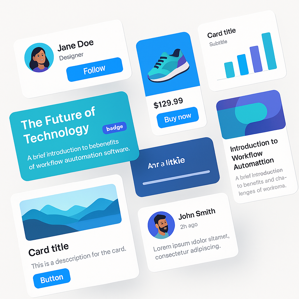
Practical Bootstrap Card Examples
Basic Card with Header and Footer
Beyond the basics, you can add structural context with headers and footers. By adding a div with the class .card-header or .card-footer within your main .card element, you can segment information effectively. Headers are perfect for displaying a title, category, or navigational tabs, while footers are commonly used for action buttons, last-updated timestamps, or supplemental links. These sections come with their own distinct styling, including a subtle background color and border, which helps them stand out from the main card body without additional CSS.
Image Overlays and Text Alignment
For a more visually striking presentation, Bootstrap allows you to place text directly over an image using the .card-img-overlay class. This technique is ideal for hero sections, banners, or portfolio items where the image is the primary focus. You apply this class to a div that contains your text elements, and place it inside the .card wrapper alongside the image. To ensure your text is legible, you might need to use Bootstrap’s color utilities, like .text-white, and consider adding a semi-transparent background overlay using custom CSS for better contrast. Furthermore, Bootstrap’s text alignment utilities, such as .text-center or .text-end, can be applied to the .card-body or overlay to precisely position your content.
![Image: A Bootstrap card with a dramatic image overlay and centered text]
Grouping Cards with Card Groups and Masonry
When you need to display multiple cards together, Bootstrap provides several powerful options. The .card-group class is an excellent choice when you want a set of cards to be of equal height and width, creating a uniform, connected grid. This is perfect for pricing tables or feature comparisons. For more dynamic, Pinterest-style layouts, a Masonry grid is the go-to solution. While older Bootstrap versions required a JavaScript library for this, modern CSS makes it much simpler. The 2022 Web Almanac by HTTP Archive reports that CSS Grid is now used by over 80% of both desktop and mobile sites, making it a first-class citizen for creating these complex layouts without extra JavaScript. You can now achieve a Masonry effect with Bootstrap’s grid system and a few CSS properties, a technique often demonstrated in tutorials.
Advanced Customization with Utilities
The true power of Bootstrap lies in its extensive library of utility classes, which allow for deep customization without writing a single line of custom CSS. You can easily modify a card’s appearance using these utilities. Add a splash of color with background classes like .bg-primary or .bg-light, and ensure text is readable with corresponding color utilities. Adjust spacing with margin (m-3) and padding (p-4) classes to give your components breathing room. You can even change border styles and colors using classes like .border-success and .border-2. Combining these utilities gives you granular control over every aspect of the card’s design, enabling you to match it perfectly to your site’s branding. This flexible approach is a core theme across all Bootstrap Examples.
Best Practices and Accessibility
Creating beautiful cards is only half the battle; they must also be accessible to all users. Start by using semantic HTML. The .card-title should always be a heading element (e.g.,
), which helps screen reader users navigate the content structure. For any image within a card that conveys information, always provide descriptive alt text. If the image is purely decorative, use an empty alt="" attribute. Color contrast is another critical factor. Ensure that your text has sufficient contrast against its background color to be readable by users with low vision. Tools like the WCAG Contrast Checker are invaluable for verifying your color choices meet accessibility standards.
| Guideline | Implementation Example | Best Practice |
|---|---|---|
| Semantic Title |
|
Use heading tags for titles to improve page structure. |
| Image Accessibility | |
Provide meaningful alt text for all informative images. |
| Color Contrast | .bg-dark .text-white |
Check color pairs with a contrast tool to ensure AA/AAA compliance. |
Putting It All Together: A Complete Example
Let’s imagine building a product display for an e-commerce site. Each product would be in a .card. You would start with a .card-img-top for the product photo. Inside the .card-body, a
with .card-title would hold the product name, and a
with .card-text would give a brief description. You could add a pricing badge using Bootstrap’s badge component. The .card-footer could contain an “Add to Cart” button, styled with .btn .btn-primary. By placing several of these cards inside a responsive grid row, you create a clean, functional, and visually appealing product listing. This modular approach is precisely why developers rely on Bootstrap. For a deep dive into a similar structure, you can explore a complete Bootstrap 4 Card Example, as the core principles remain highly relevant.
| Feature | Bootstrap Class | Purpose |
|---|---|---|
| Main Container | .card |
Defines the card component. |
| Image | .card-img-top |
Places an image at the top of the card. |
| Content Area | .card-body |
Provides padding for text and other elements. |
| Action Area | .card-footer |
A dedicated section for buttons or metadata. |
![Image: A grid of fully-styled product cards on an e-commerce page]
As you can see, Bootstrap cards are far more than simple boxes. They are a robust, customizable, and essential tool for building modern, responsive web interfaces. From basic content containers to complex, interactive elements, the possibilities are nearly endless. We encourage you to start with these examples, experiment with different utility classes and structural combinations, and see how you can adapt them to fit your unique project needs. At ITSolutionStuff, we’re committed to providing the practical examples and in-depth tutorials you need to succeed.
Leave a Reply