The Foundation: Clarity, Simplicity, and User Control
In the hyper-competitive world of mobile applications, a user’s first interaction is often their last. A staggering 25% of users abandon an app after just one use, according to data compiled by Upland Software’s Localytics. This swift judgment is frequently a direct reaction to the app’s user interface (UI). A confusing, cluttered, or frustrating interface is a guaranteed path to the uninstall button. This is why the foundational principles of UI design aren’t just aesthetic guidelines; they are the bedrock of user retention and app success. At the core of every great mobile UI are three interconnected pillars: clarity, simplicity, and user control. These principles work in concert to create an experience that feels intuitive, efficient, and respectful of the user’s time and cognitive energy. They ensure that the app is not just a tool, but a seamless extension of the user’s intent.
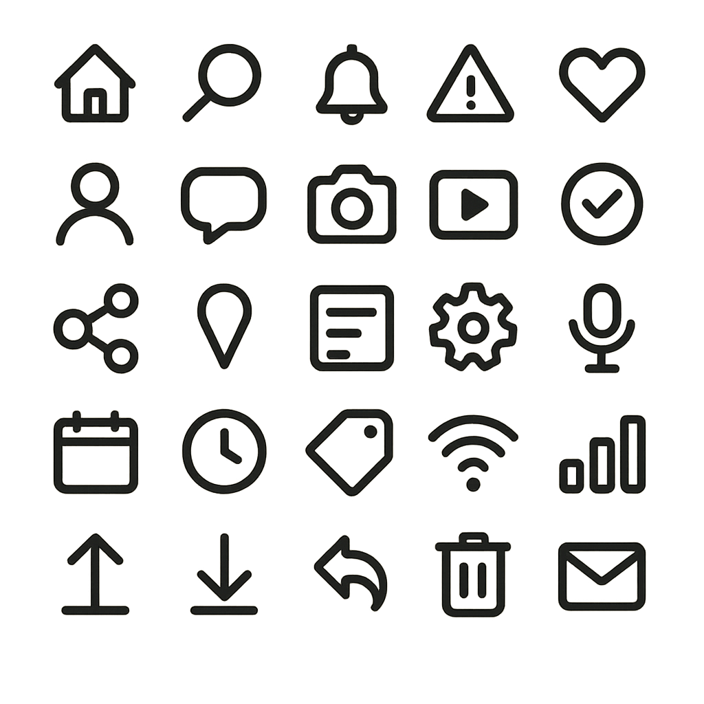
Clarity is the most fundamental requirement. If users cannot understand what they are looking at or what an element does, the app has failed before it has even begun. A clear interface communicates its structure and purpose without ambiguity. This is achieved through a combination of legible typography, universally understood iconography, and logical labeling. Every button, icon, and menu should have a clear, predictable function. Avoid using abstract icons without text labels unless their meaning is absolutely universal, like a magnifying glass for search or a house for the home screen. The goal is to eliminate guesswork. Users should be able to look at a screen and instantly grasp the primary actions they can take. A clear visual hierarchy, which we will discuss later, is paramount to guiding the user’s attention and making the interface scannable and digestible. The language used in the app, from button labels to error messages, must be plain, concise, and direct, avoiding technical jargon that could confuse the average user.
Flowing directly from clarity is the principle of simplicity, often summarized by the famous design mantra, “less is more.” A simple interface is one that is free of unnecessary elements and distractions. Every component on the screen should have a reason to be there. By stripping away visual clutter, you reduce the cognitive load on the user—the amount of mental effort required to use the app. This allows them to focus on their primary goal, whether it’s booking a flight, sending a message, or tracking a workout. Effective use of white space, or negative space, is a key technique for achieving simplicity. It isn’t empty space; it’s an active design element that helps to group related items, separate unrelated ones, and improve overall legibility and focus. A simple design prioritizes the most common user tasks, making them easily accessible, while secondary or less-used features might be placed in a menu or a settings screen. The challenge is not to see how much you can add, but how much you can take away while still delivering powerful functionality.
Finally, a well-designed app must grant users a pervasive sense of user control and freedom. People feel anxious and frustrated when they feel trapped or when the app behaves in unexpected ways. A robust UI puts the user in the driver’s seat. This means providing clear and consistent navigation so they always know where they are and how to get back. The back button should function predictably. Users should be able to easily undo actions, especially destructive ones like deleting content. A confirmation dialog before a permanent deletion is a classic example of giving users control and a chance to prevent errors. This principle, as outlined in Jakob Nielsen’s usability heuristics, is about providing “exits” for unwanted states without forcing the user to go through an extended process. When a user feels they can explore an app without fear of making irreversible mistakes, they are more likely to engage deeply with its features and build trust in the product.
Structuring the Visual Experience: Hierarchy and Layout
Once the foundational philosophy is set, the next step is to translate it into a tangible visual structure. This involves intentionally arranging elements on the screen to guide the user’s eye and create a logical, organized, and aesthetically pleasing experience. The two most powerful tools for this are visual hierarchy and a consistent layout system. These elements work together to bring order to the interface, making it scannable and easy to navigate, which is especially critical on the constrained real estate of a mobile screen. A well-structured interface feels intuitive because it aligns with how people naturally scan and process information, directing their attention to what matters most and creating a sense of rhythm and predictability.
Visual hierarchy is the art and science of prioritizing content by making certain elements stand out more than others. Without a clear hierarchy, every element on the screen competes for attention, leading to a chaotic and overwhelming experience. A strong hierarchy tells the user where to look first, second, and third. This is achieved by manipulating several visual cues. Size is one of the most effective tools; larger elements naturally draw more attention. A headline is larger than a subheading, which is larger than the body text. Color and contrast are also powerful. A brightly colored call-to-action button will stand out against a muted background. High contrast between text and its background improves readability and also draws the eye. Placement is crucial; elements at the top of the screen are typically perceived as more important than those at the bottom. The way these cues are combined helps users process information in predictable patterns, such as the F-pattern or Z-pattern, where the eye scans from top-left across, then down, and across again. By understanding and applying these principles, designers can strategically guide users through a workflow or toward a desired action.
A consistent layout and grid system provides the underlying skeleton for your UI. A grid is an invisible structure of columns and margins that helps you align elements on the screen with precision. Using a grid ensures that elements are spaced and positioned consistently across all screens of your app. This creates a sense of order, harmony, and professionalism. It eliminates the need to make arbitrary decisions about alignment and spacing for every new screen, which speeds up the design and development process. For developers, building with a structured layout in mind makes it easier to create components that can be reused throughout the app, a key practice for efficiency. You can find more information about this by learning about creating reusable custom widgets in Flutter. Furthermore, a well-defined grid is essential for creating a responsive design that adapts gracefully to various screen sizes and orientations, from a small smartphone to a large tablet. Without a grid, scaling an interface can result in a misaligned, broken mess.
Platform-Specific Guidelines: iOS vs. Android
While universal design principles form the core of good UI, it’s crucial to acknowledge and respect the native conventions of the operating systems your app will run on. Users become deeply accustomed to the interaction patterns of their chosen platform. An app that ignores these conventions can feel foreign and clunky. Apple’s Human Interface Guidelines (HIG) and Google’s Material Design are comprehensive design systems that provide guidance on everything from navigation and typography to iconography and motion. Adhering to these guidelines ensures your app feels like a natural part of the ecosystem, reducing the learning curve for the user.
Key differences exist in navigation patterns, control styles, and even typography. For example, Android has a persistent system back button, while iOS navigation relies heavily on a back button within the app’s top bar and swipe gestures. The visual language also differs; Material Design often uses more pronounced shadows (elevation) and bold color, while iOS design tends to favor blur effects, translucency, and a flatter aesthetic. Understanding these nuances is critical for delivering a truly native experience. While you can maintain your brand’s unique identity, it should be expressed within the framework of the platform’s established patterns.
| Feature | Apple’s Human Interface Guidelines (iOS) | Google’s Material Design (Android) |
|---|---|---|
| Navigation | Top navigation bar with a contextual back button; tab bars at the bottom. | More flexible; can use top app bars, bottom navigation, navigation drawers. System-level back button. |
| Buttons | Often text-based or filled with rounded corners. Minimalist style. | More pronounced with clear elevation (shadows). Can be contained, outlined, or text. |
| Typography | San Francisco (SF) is the system font. Focus on clarity and legibility. | Roboto is the standard system font. A comprehensive type scale is defined. |
| Alerts | Centered modal dialogs. | Can be centered modal dialogs or less intrusive snackbars/toasts at the bottom. |
Crafting an Intuitive Interaction Model
Beyond the visual structure, the quality of a mobile UI is defined by how it feels to interact with it. An intuitive interaction model is one where the user’s actions produce expected and understandable results, making the app feel responsive, reliable, and even delightful. This is achieved through a deep focus on consistency, feedback, and ergonomics. These principles govern the behavior of the interface, ensuring that using the app is a smooth and frictionless process. A strong interaction model builds user confidence and transforms a static design into a dynamic and engaging experience. It’s the difference between an app that simply works and one that is a joy to use.
Consistency and standards are the cornerstones of a usable interface. This principle operates on two levels: internal and external. Internal consistency means that elements within your app look and behave in the same way. A specific icon should always have the same function, buttons with a certain style should always perform a similar type of action, and the navigation structure should be predictable from one screen to the next. This consistency means users only have to learn a pattern once. External consistency involves adhering to the platform conventions we discussed earlier. By using standard controls and patterns that users already know from other apps on their device, you leverage their existing knowledge and dramatically reduce their learning curve. When you invent a completely new or non-standard interaction for a common task, you force users to stop and think, introducing friction and potential confusion. As Jakob Nielsen states, “Users spend most of their time on other sites. This means that users prefer your site to work the same way as all the other sites they already know.”
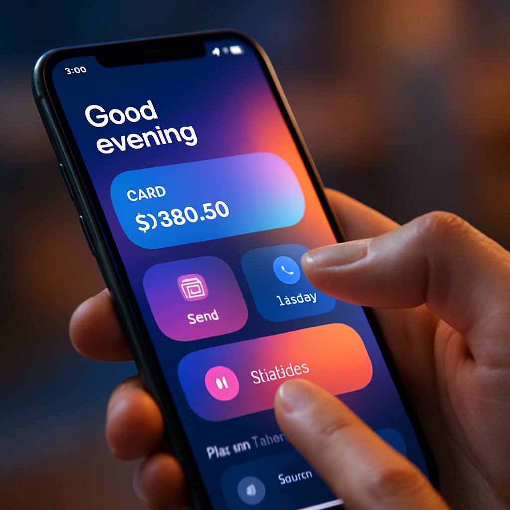
An interface must communicate with the user, and this is where feedback and affordance come into play. The system should always keep users informed about what is going on through appropriate feedback within a reasonable time. When a user taps a button, it should visually change state (e.g., darken or animate) to acknowledge the tap. When content is loading, a spinner or progress bar should be displayed to manage expectations and show that the app hasn’t frozen. Success messages confirm that an action was completed, while clear error messages explain what went wrong and how to fix it. Affordance is the quality of an object or element that suggests how it is supposed to be used. A button should look “pressable,” a slider should look “draggable,” and text that isn’t interactive shouldn’t look like a link. By providing strong affordances and constant feedback, you create a transparent and trustworthy dialogue between the user and the app.
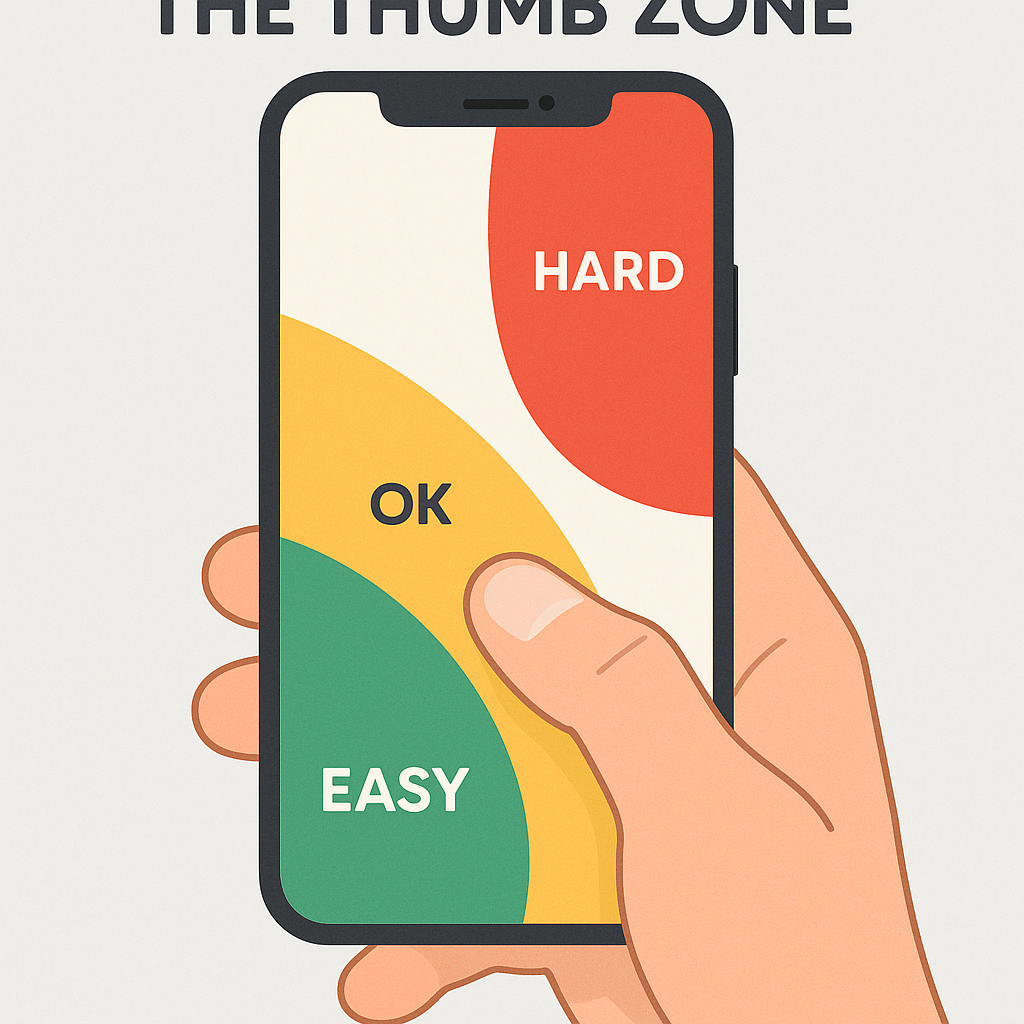
Finally, designing for mobile means considering the physical reality of how the device is held and used. Ergonomics and the thumb zone are critical for usability, especially with today’s large-screen smartphones. The thumb zone refers to the area of the screen that is most easily and comfortably reached by the thumb when holding the phone one-handed. A study by mobile expert Steven Hoober found that nearly 50% of users navigate with one thumb. Placing primary navigation controls, call-to-action buttons, and other frequently used interactive elements within this easy-to-reach zone can significantly improve the user experience. Conversely, placing important controls at the very top of a large screen forces users into an awkward hand shuffle, increasing the risk of dropping the phone and making the interaction feel clumsy. Thoughtful placement of UI elements according to the thumb zone is a hallmark of a truly user-centered mobile design.
The Power of Microinteractions
Often overlooked but incredibly powerful, microinteractions are the small, contained moments that happen when a user interacts with the interface. They are the subtle animations and visual cues that provide feedback, guide the user, and add a layer of personality and delight. Think of the small animation when you “like” a post, the way a switch smoothly slides from on to off, or the satisfying bounce of a pull-to-refresh indicator. These moments, while small, have a huge impact on the perceived quality of an app. They make the interface feel alive, responsive, and polished. Good microinteractions serve a purpose: they communicate a state change, prevent errors, or draw attention to an important update. They turn a mundane task into something more engaging and human, reinforcing the user’s actions and making the entire experience feel more rewarding.
The Aesthetic and Emotional Connection: Color, Typography, and Imagery
While functionality and usability are paramount, the aesthetic quality of an app plays a massive role in shaping user perception and forging an emotional connection. A visually appealing interface is perceived as more trustworthy and usable. This is known as the aesthetic-usability effect. Color, typography, and imagery are the tools designers use to create a distinct brand identity, evoke specific emotions, and enhance the overall usability of the app. These elements are not mere decoration; they are integral components of the communication process. When used thoughtfully, they can elevate an app from a functional tool to a memorable and desirable experience, creating a strong brand presence in a crowded marketplace.
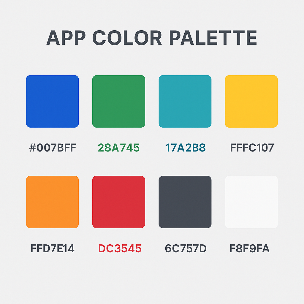
Color psychology and the creation of a brand palette are critical. Colors have the power to influence mood and draw attention. A well-defined color palette, typically consisting of a primary, secondary, and accent color, helps to establish brand identity and create visual consistency. For example, financial apps often use blues and greens to evoke feelings of trust and growth, while food delivery apps might use reds and oranges to stimulate appetite. Beyond branding, color is a powerful usability tool. The accent color is often reserved for key interactive elements like call-to-action buttons and links, making them stand out. Most importantly, color choices must be made with accessibility in mind. According to the World Health Organization, at least 2.2 billion people have a near or distance vision impairment. Ensuring a high contrast ratio between text and its background is essential for legibility, especially for users with visual impairments. Tools are readily available to check your color palette against the W3C’s Web Content Accessibility Guidelines (WCAG), which provide clear standards for contrast ratios.
Typography is the art of arranging type to make written language legible, readable, and appealing when displayed. For mobile apps, readability is the absolute priority. The font choice, size, and spacing directly impact how easily a user can consume information. Choose a typeface that is clear and legible on small screens; overly decorative or complex fonts can be disastrous for usability. Establish a clear typographic scale with defined styles for headlines, subheadings, body text, and captions. This creates hierarchy and consistency throughout the app. Pay close attention to line height (the space between lines of text) and letter spacing to ensure text doesn’t feel cramped or difficult to read. The goal of good typography is to be invisible; the user should be able to read the content effortlessly without being consciously aware of the font itself.
Imagery and iconography are essential for communicating complex ideas quickly and creating a visually rich experience. High-quality photographs, illustrations, and videos can enhance the brand’s story and make the app more engaging. Icons are a form of visual shorthand, helping users navigate and understand functions without relying solely on text. When selecting or designing icons, prioritize clarity and universal recognition. A confusing icon is worse than no icon at all. It’s crucial to use a consistent style for all icons within your app to maintain a cohesive look and feel. While custom icons can strengthen brand identity, they should be rigorously tested with users to ensure their meaning is clear. Thoughtful use of imagery and clear iconography can break up dense blocks of text, guide the user, and make the entire interface more scannable and visually appealing.
Accessibility as a Core Principle
Designing for accessibility means creating products that are usable by everyone, regardless of their abilities. This is not an optional extra or a niche concern; it is a fundamental aspect of good design and ethical responsibility. An accessible UI benefits all users by making the interface more robust and flexible. Key practices include providing high color contrast, supporting dynamic type so users can resize text to their needs, adding alternative text (alt-text) for all images so screen readers can describe them to visually impaired users, and ensuring all interactive elements are clearly labeled and can be navigated using assistive technologies. Embracing accessibility from the start of the design process often leads to a cleaner, more logical, and more user-friendly design for everyone. A great place to start is to familiarize yourself with accessibility standards like those from the Nielsen Norman Group. Moreover, designing for accessibility can be seen as an opportunity to build a more user-centric application, and in many cases, it makes good business sense by expanding the potential user base of your app. For instance, allowing users to customize their experience by supporting dark theme in apps is both an accessibility feature and a highly requested personalization option.
Driving Engagement and Retention Through UI
Ultimately, the goal of a mobile app is to be used, and used often. Excellent UI design is a direct driver of user engagement and retention. A well-crafted interface not only attracts users but also guides them to discover the app’s value, encourages them to build habits, and motivates them to return. This is where UI design transcends simple usability and becomes a strategic tool for business growth. By thoughtfully designing key user journeys like onboarding, personalization, and gamification, you can create an experience that is sticky, rewarding, and keeps users coming back for more.
The onboarding process is your app’s first, and perhaps only, chance to make a great impression. A successful onboarding flow should be quick, clear, and value-focused. It needs to teach new users the basics of the app and, more importantly, guide them to their “aha moment”—the point where they understand the core value the app provides. Avoid long, front-loaded tutorials that force users to read pages of instructions. Instead, opt for a progressive disclosure approach, introducing features contextually as the user needs them. An effective onboarding might consist of a few brief screens highlighting key benefits, followed by a request for only the most essential permissions or information to get started. The goal is to get the user into the app and achieving a meaningful task as quickly as possible. A frictionless onboarding experience reduces initial abandonment and sets the stage for long-term engagement.
Personalization and customization make users feel that the app is truly theirs. By allowing users to tailor the interface to their preferences, you create a more comfortable and efficient experience. A simple and immensely popular example is offering a dark mode option. For many users, dark mode is easier on the eyes, especially in low-light conditions, and can even conserve battery life on OLED screens. Beyond visual themes, personalization can involve allowing users to reorder their navigation, choose the content they want to see on their home screen, or set custom notifications. According to a report by SmarterHQ, 72% of consumers say they only engage with personalized marketing messages. This preference for tailored experiences extends directly to the apps they use. When an app adapts to a user’s needs and preferences, it fosters a deeper sense of ownership and loyalty.
| Common UI Testing Methods | Description | Best For |
|---|---|---|
| Usability Testing | Observing real users as they attempt to complete tasks in your app. | Identifying pain points, validating workflows, and gathering qualitative feedback. |
| A/B Testing | Showing two or more versions of a screen to different user segments to see which one performs better against a specific goal (e.g., conversion rate). | Optimizing specific elements like button color, text copy, or layout for a measurable outcome. |
| Surveys & Feedback Forms | Directly asking users about their experience, satisfaction, and suggestions. | Gathering quantitative and qualitative data on user sentiment and feature requests. |
| Analytics Review | Analyzing user behavior data (e.g., session time, feature usage, drop-off points) to identify patterns and problem areas. | Understanding what users are actually doing in your app at a large scale. |
Testing and Iteration: The Path to Perfection
A brilliant UI is never born in a single stroke of genius; it is forged through a continuous cycle of testing and iteration. Design is a process of making hypotheses, and the only way to know if those hypotheses are correct is to test them with real users. Methods like usability testing, where you observe users interacting with your app, are invaluable for uncovering hidden pain points and flawed assumptions. A/B testing allows you to compare different design variations scientifically to see which one better achieves a specific goal. User surveys and in-app feedback mechanisms provide a direct line to your user base, offering a wealth of qualitative insights. Data from analytics platforms can reveal where users are dropping off or which features are being ignored. The key is to embrace the mindset that the first version of any design is just a starting point. By consistently gathering data, listening to users, and being willing to refine the interface, you can evolve your app from good to great. There’s always room for improvement, and our collection of mobile UX design tips and tricks can provide further inspiration for your next iteration.
These principles, from foundational clarity to iterative testing, are not just a checklist but a mindset. They represent a commitment to placing the user at the center of every design and development decision. By building interfaces that are clear, simple, and empowering, you do more than just create a functional product; you build trust, foster loyalty, and create an experience that users will want to return to again and again. At Kodeco, we believe that mastering these principles is essential for any developer or team looking to make their mark in the mobile world. We encourage you to dive deeper, experiment with these concepts in your own projects, and continue learning as you build the next generation of engaging apps. Further resources like those offered by Interaction Design Foundation can also provide a deeper well of knowledge for your design journey.
Leave a Reply